TOFU · G
9개월 만에 3개국으로 확장한 글로벌 F&B 브랜드 TOFU · G. 1~4호점 공간 디자인과 SI 시스템을 구축했습니다.TOFU · G, a global F&B brand that scaled to 3 countries in just 9 months. I built the spatial design and SI system for stores 1–4.
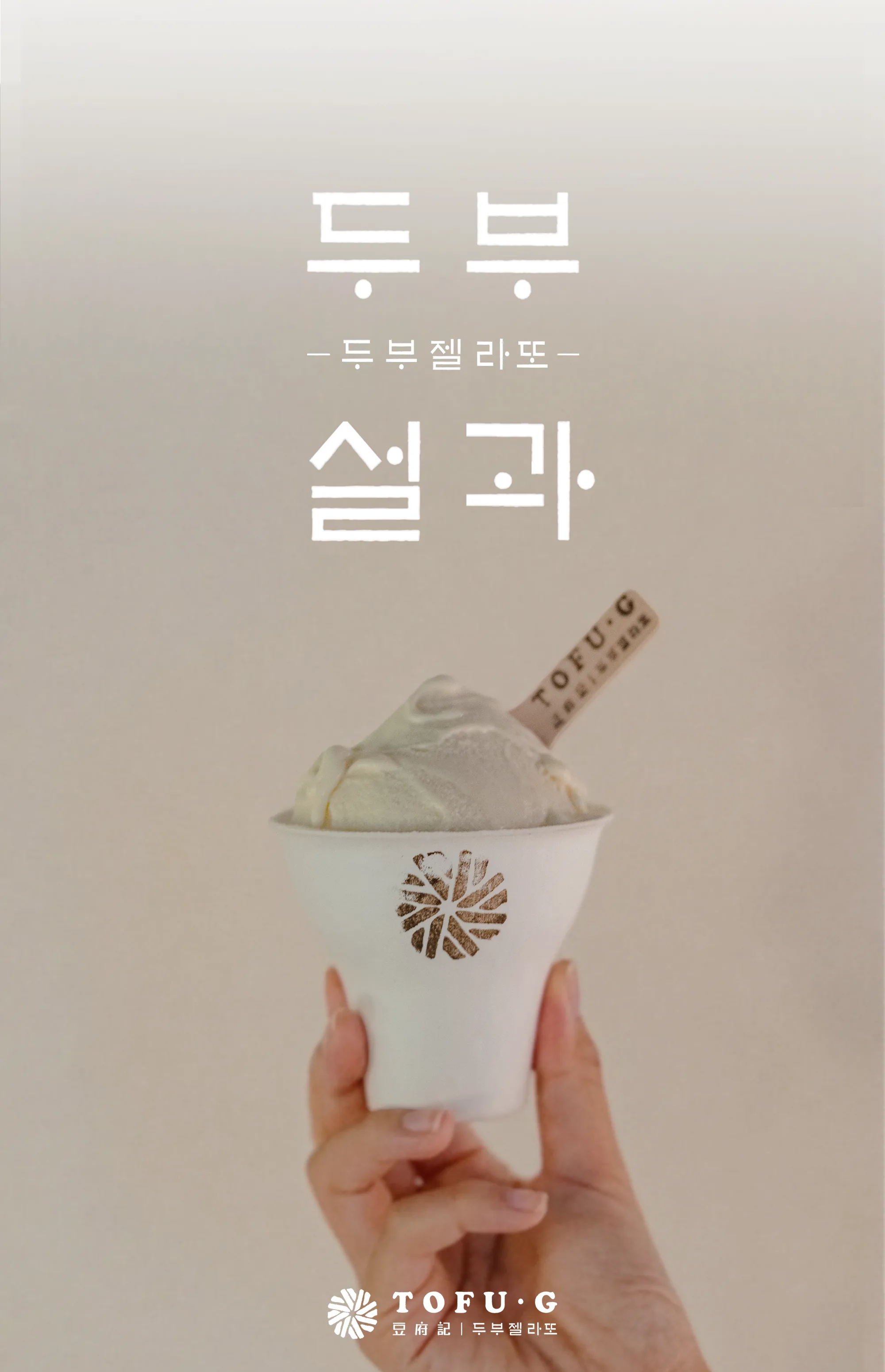
한국 전통 두부 제조의 정성을 담은 프리미엄 젤라또 브랜드 TOFU · G. 맷돌과 한국 전통 주방에서 영감받은 공간 디자인·브랜딩으로, 싱가포르 오차드 로드에서 시작해 말레이시아·인도네시아로 확장 중입니다.TOFU · G is a premium gelato brand capturing the devotion of traditional Korean tofu-making — with spatial design and branding inspired by the Maetdol (millstone) and heritage Korean kitchen, it began on Orchard Road in Singapore and is now expanding across Malaysia and Indonesia.
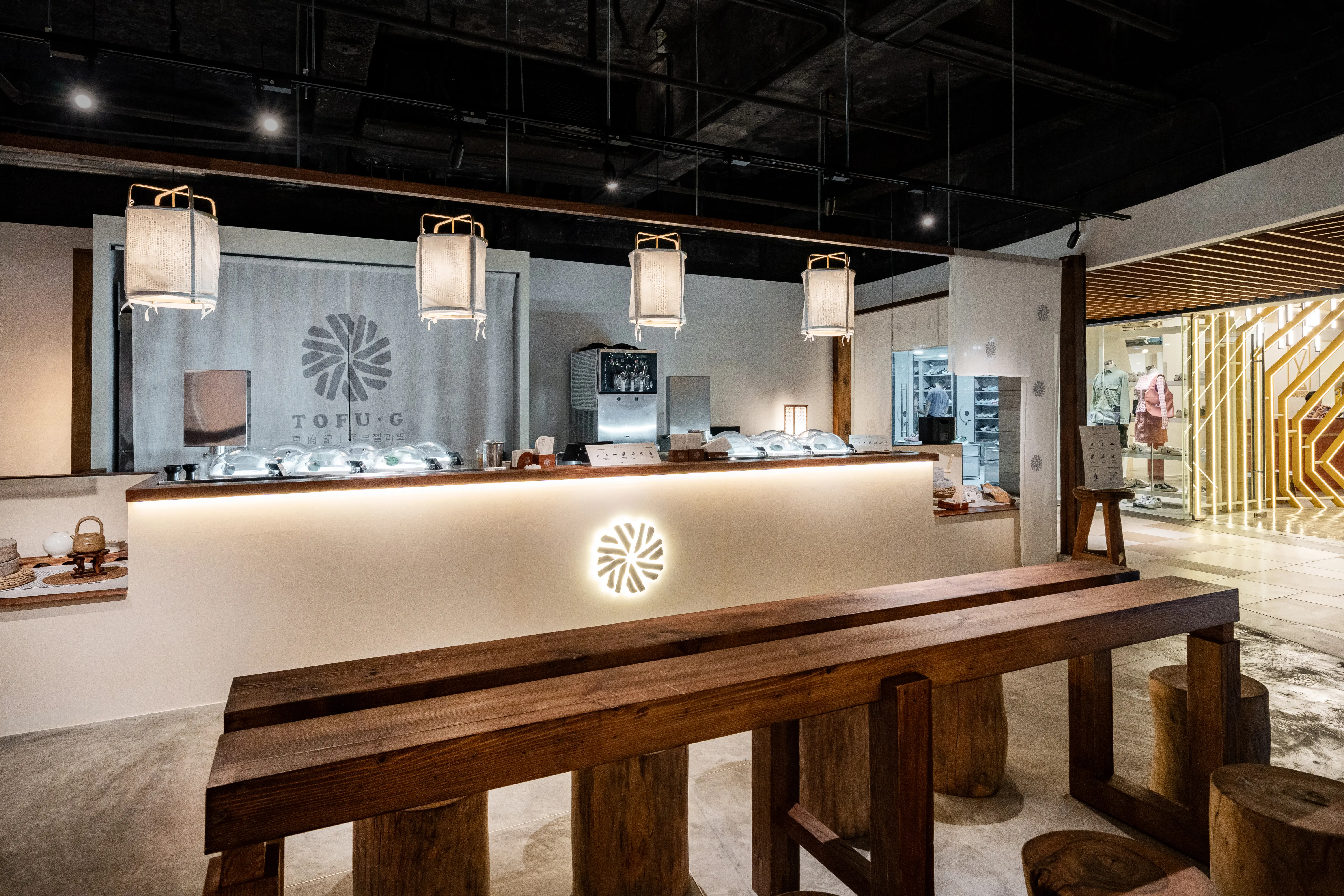
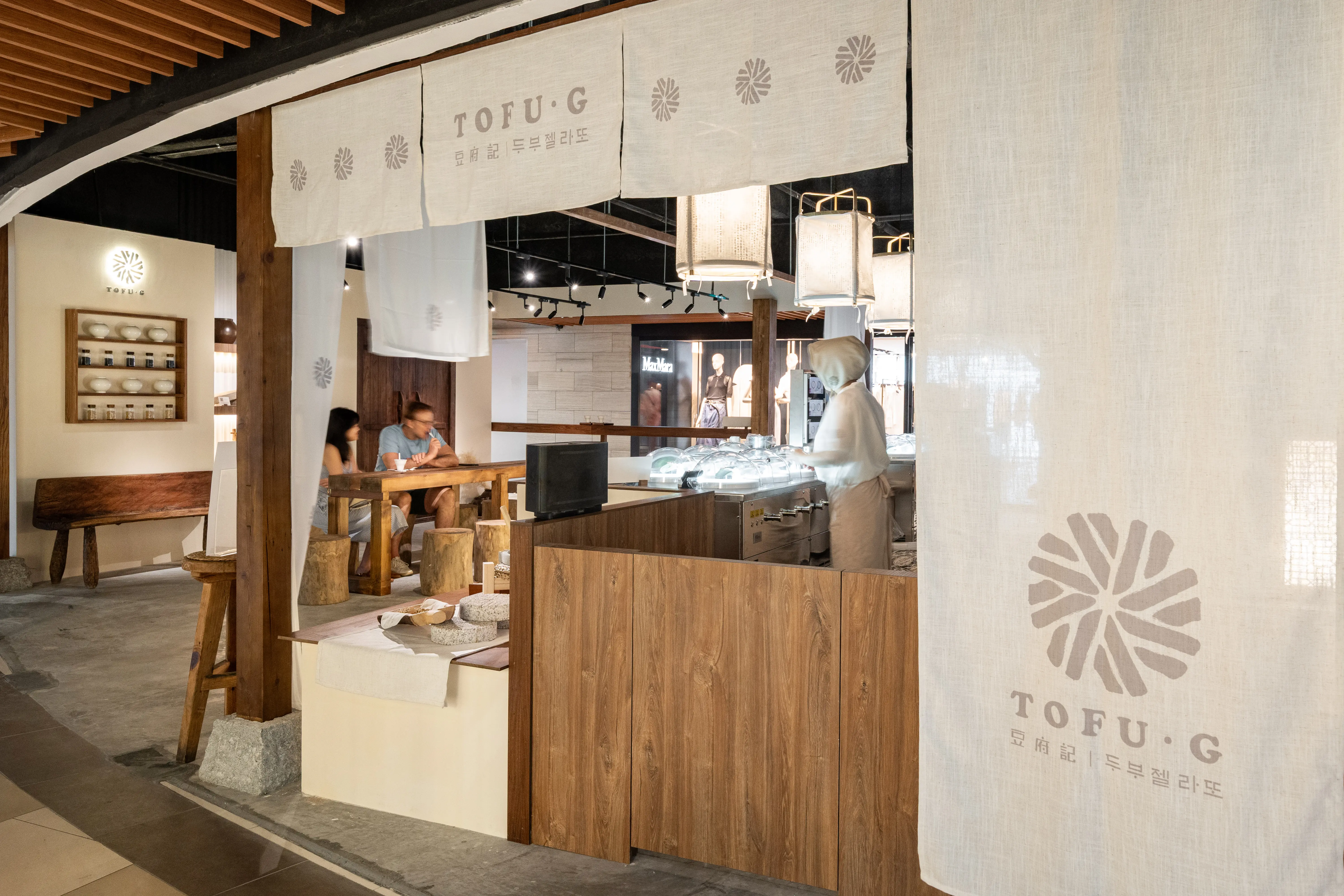
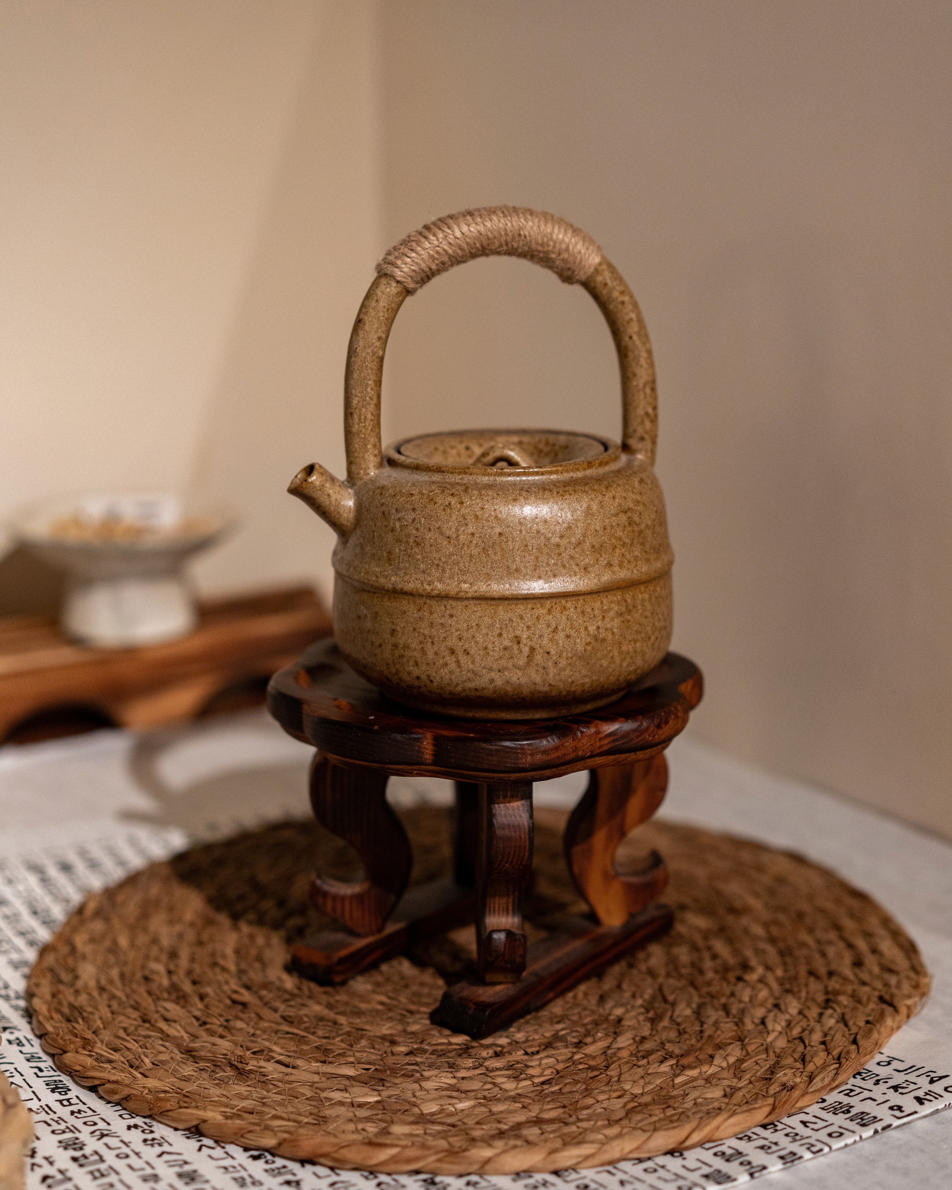
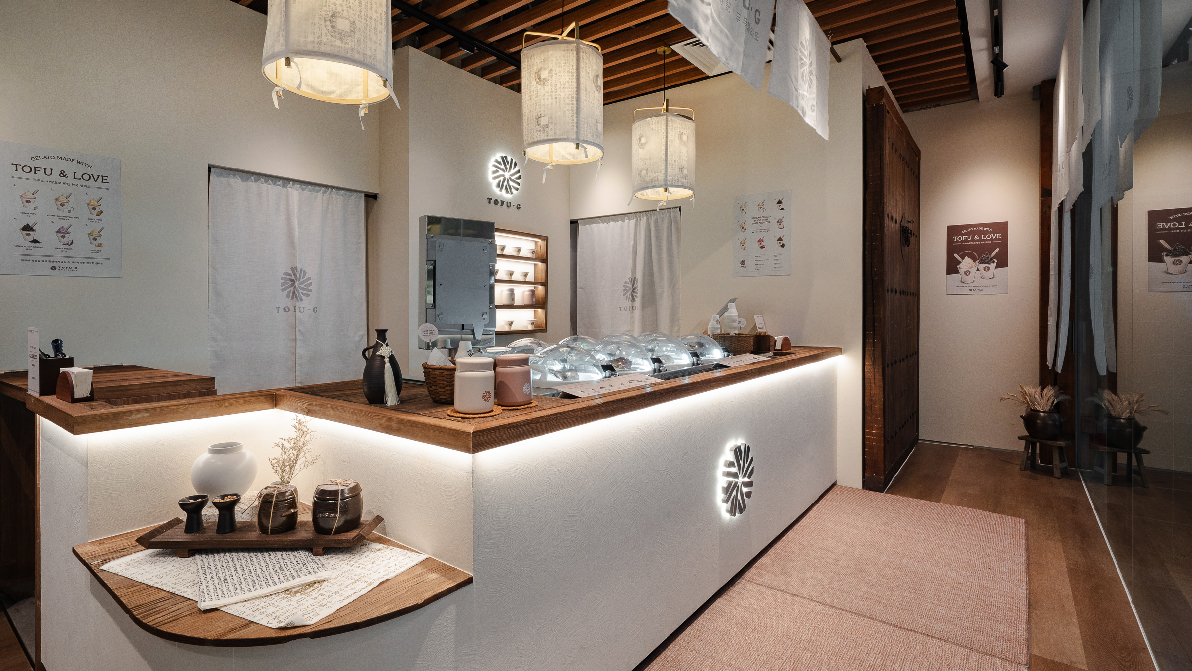
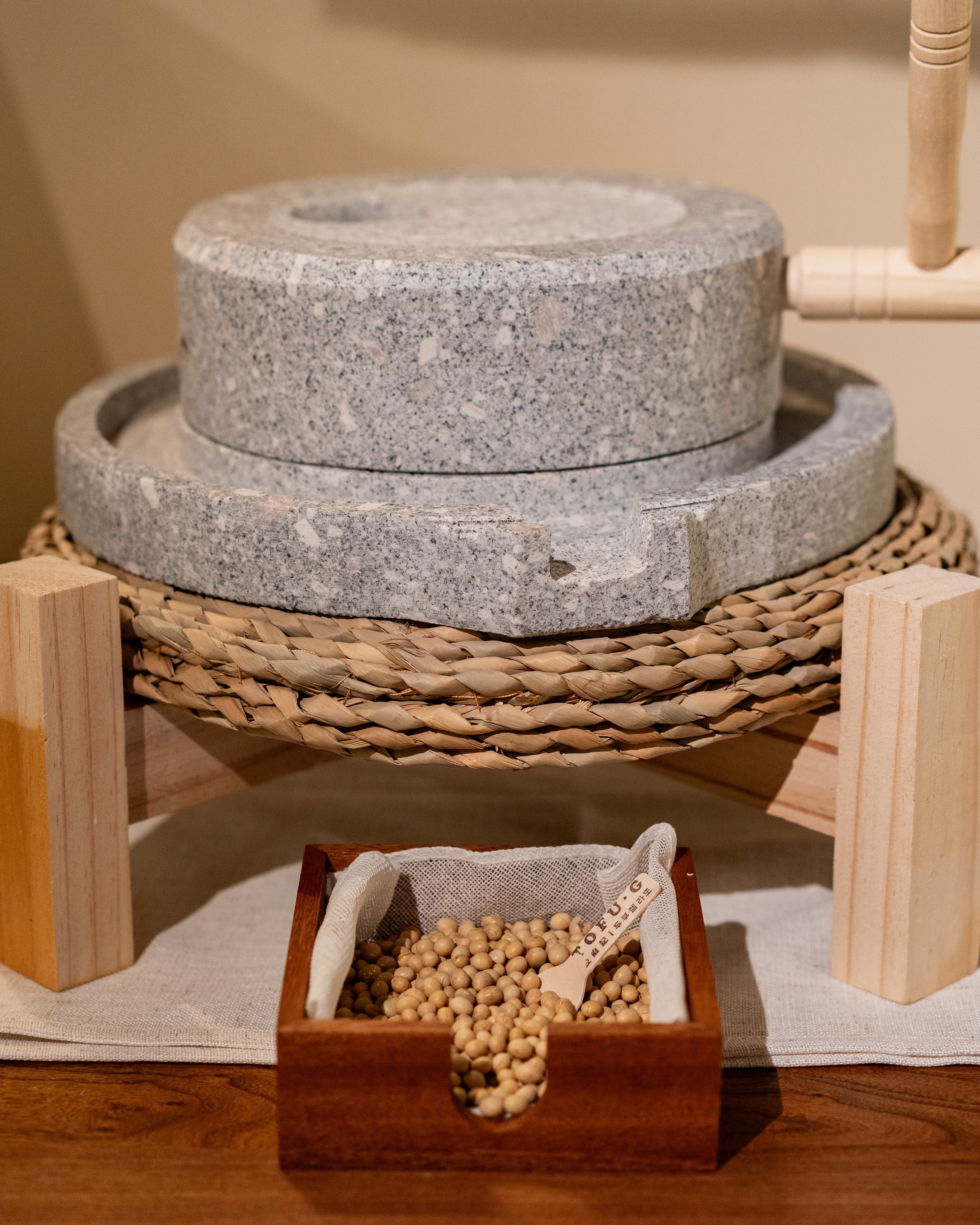
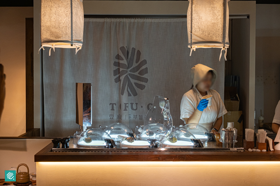
TOFU·G의 공간은 하루의 온기가 피어나던 한국의 전통 주방에서 시작됩니다. 콩을 고르고 맷돌로 천천히 갈아, 정성으로 기다려 굳혀내던 두부처럼 그 고요한 시간을 공간의 소재와 디테일에 담았습니다. 전통적 터치와 현대적 감각이 공존하는 이곳에서, 고객은 브랜드의 철학을 시각과 미각으로 동시에 경험합니다. 매일 매장에서 직접 만드는 신선한 두부 젤라또 한 스쿱은, 단순한 디저트를 넘어 하나의 작품이 됩니다.TOFU·G's space begins in the traditional Korean kitchen, where the warmth of each day once rose. Like tofu — beans selected, slowly ground on the millstone, and patiently left to set — that quiet, unhurried time is woven into the materials and details of the space. Where tradition meets contemporary sensibility, guests experience the brand's philosophy through both sight and taste — and each scoop of tofu gelato, freshly made in-store every day, becomes not just a dessert but a work of art.
“두부 한 모에 담긴 정성을, 한 입의 젤라또에 담다.”“The devotion held in a single block of tofu, poured into a single spoonful of gelato.”
9Months·4Stores·1Spatial System
싱가폴 4개 매장. 하나의 공간 시스템, 지금 브랜드가 국경을 넘어 확장 중.
4 stores in Singapore. One spatial system, now scaling the brand across borders.
Work Scope
공간 디자인 · 브랜딩 · 시공 · 브랜드 공간 가이드Spatial Design · Branding · Construction · Spatial Guide
Project Type
F&B 젤라또 브랜드 · 멀티 스토어F&B Gelato Brand · Multi-store
Partner
CLIENT | INITIA GROUP SG
01 — Overview
검증된 성과
Proven Results
2024년 7월 첫 오픈 이후 9개월 만에 싱가폴 4개 매장과 브랜드 공간 가이드라인(SI)을 구축했고, 그 시스템으로 브랜드는 3개국 9개 매장으로 확장 중입니다.
Since its first opening in July 2024, I built 4 Singapore stores and the brand's spatial guideline (SI) in just 9 months; on that system the brand is now scaling to 9 stores across 3 countries.
싱가포르 1호점의 공간 브랜드 컨셉 기획과 공간 디자인을 통해 브랜드의 시각적 아이덴티티를 정립했으며, 추후 이니시아(Initia Group) 소속으로 2호점부터 4호점 플래그십 매장까지의 프로젝트를 연속성 있게 진행했습니다. 이 과정에서 지속적인 매장 확장이 가능하도록 표준화된 공간 디자인 시스템(SI 가이드라인)을 완벽히 구축했습니다.
I established the brand's visual identity through the spatial concept planning and interior design of the first store in Singapore. Subsequently, as part of Initia Group, I seamlessly executed consecutive projects from the 2nd store through to the 4th, the flagship. Through this trajectory, I built a standardized Spatial Identity (SI) guideline to support sustainable, scalable brand expansion.
9
매장
Stores
3개국 · 5 운영 · 4 예정
3 countries · 5 open · 4 soon
1,400+
구글 리뷰
Google Reviews
as of 2026.07
1ST
싱가포르 최초
Singapore's First
Singapore's First Tofu Gelato
Press · As Seen In
Media Coverage
Time Out · Aug 2025
We Tried the Viral Korean Tofu Gelato
$8 per scoop — entirely worth it. Dairy-free without compromising creaminess.
Eatbook · Jun 2025
Korean Tofu Gelato in Orchard
Dense, creamy goodness with earthy soy notes. Rustic wood & Korean decor.
DanielFood · Aug 2025
Singapore's First Tofu Gelato Shop
Constantly full on a weekday afternoon. Black sesame had roasted depth.
Little Day Out · Mar 2026
How Good Can Tofu Gelato Be?
1,400+ Google reviews, 4.8 stars. As enjoyable as the most popular gelato shops.
The SI System
확장의 비결 — SI 시스템
The Key to Scale — the SI System
1호점의 공간을 기준으로 재료·디테일·조닝·사이니지를 표준화한 브랜드 공간 가이드라인(SI)을 구축했습니다. 덕분에 2~4호점, 그리고 해외 확장까지 일관된 브랜드 경험을 빠르고 정확하게 재현할 수 있었습니다.
Based on the first store, I standardized materials, details, zoning and signage into a brand spatial guideline (SI) — letting stores 2–4, and later overseas expansion, reproduce a consistent brand experience quickly and precisely.
1~3호점 타임랩스
Store 01–03 Timelapse
1호점 · Mandarin Gallery 타임랩스Store 01 · Mandarin Gallery Timelapse
2호점 · Takashimaya 타임랩스 (준비중)Store 02 · Takashimaya Timelapse (Coming Soon)
3호점 · UE Square 타임랩스 (준비중)Store 03 · UE Square Timelapse (Coming Soon)
02 — Story
따뜻한 정성을 한 입의 젤라또에
Warmth In Every Scoop
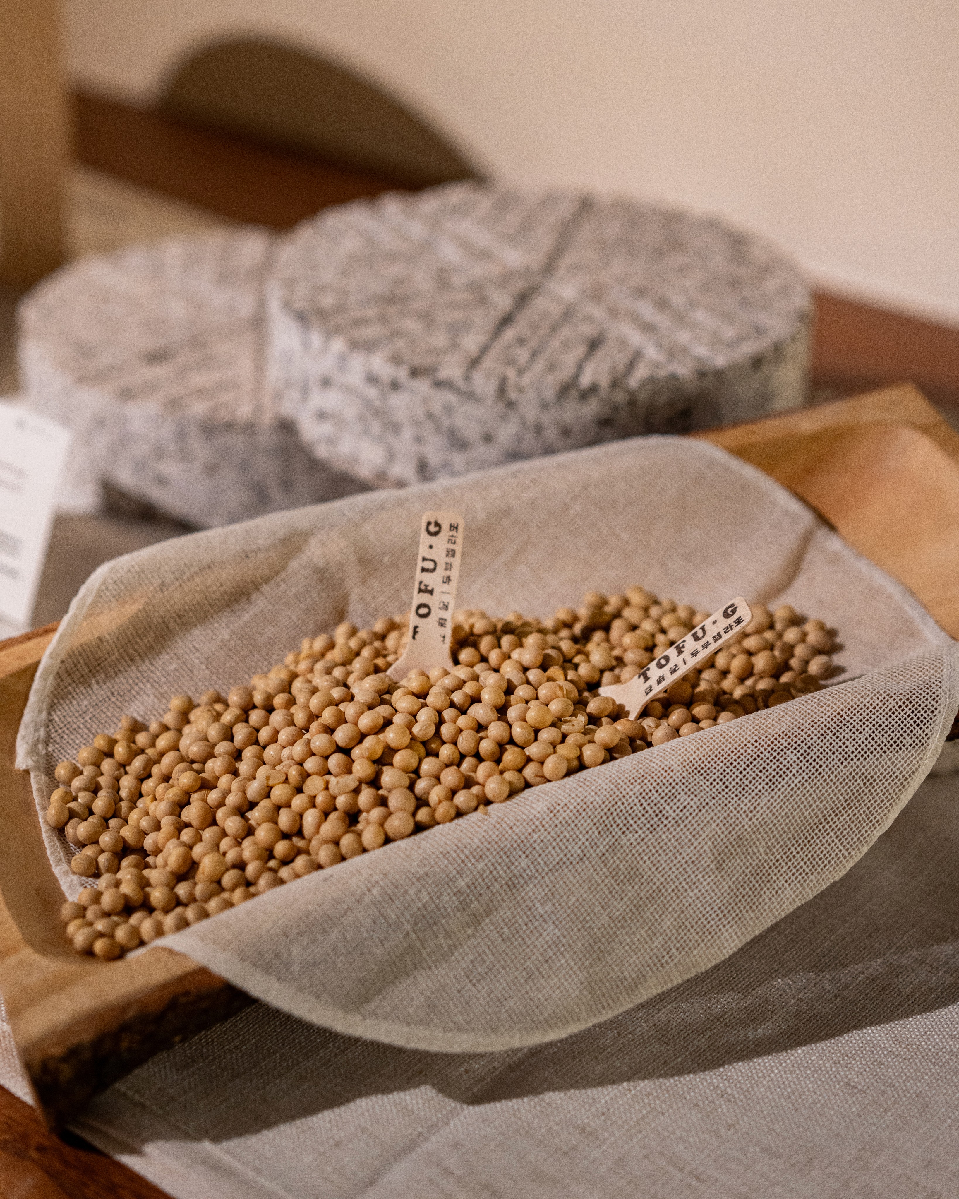
TOFU G는 따뜻한 집밥처럼, 한 입의 젤라또에 정성을 담습니다. 한국의 전통 주방은 하루의 온기가 시작되는 공간이었고, 두부는 그 안에서 시간과 정성을 들여 천천히 만들어졌습니다. 콩을 고르고, 불리고, 갈고, 끓이고, 고요하게 기다려 굳혀내는 모든 과정 속엔 음식을 향한 마음과 손끝의 애정이 담겨 있습니다.
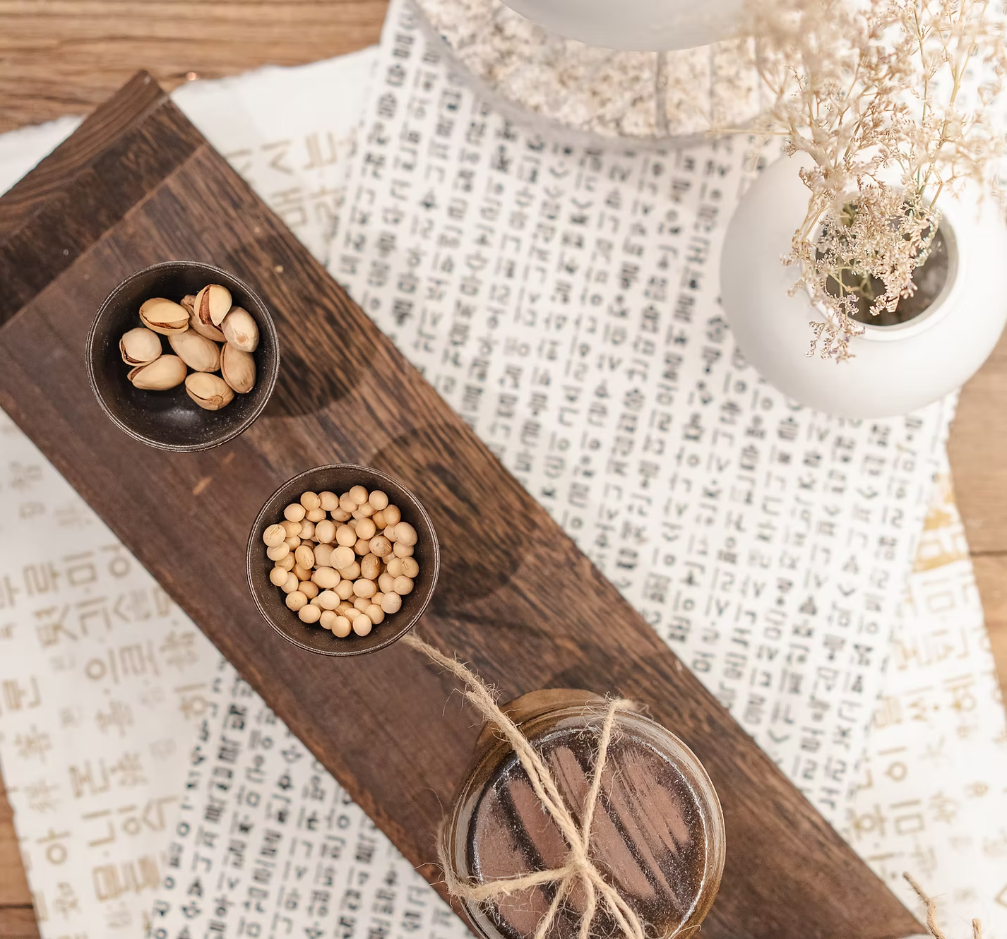
TOFU G brings home-cooked warmth to every scoop. The traditional Korean kitchen was where the warmth of each day began, and tofu was made there slowly — selecting beans, soaking, grinding, boiling, and waiting in stillness until they set. Every step carried a deep affection for food, expressed through hands and heart.
Tofu-BasedLive ChurningVegan-Friendly
Heritage Elements
한국 전통 두부 제조 과정의 세 가지 핵심 요소에서 공간과 브랜딩의 모티프를 도출했습니다.
Three core elements of traditional Korean tofu-making inspired the spatial and branding motifs.
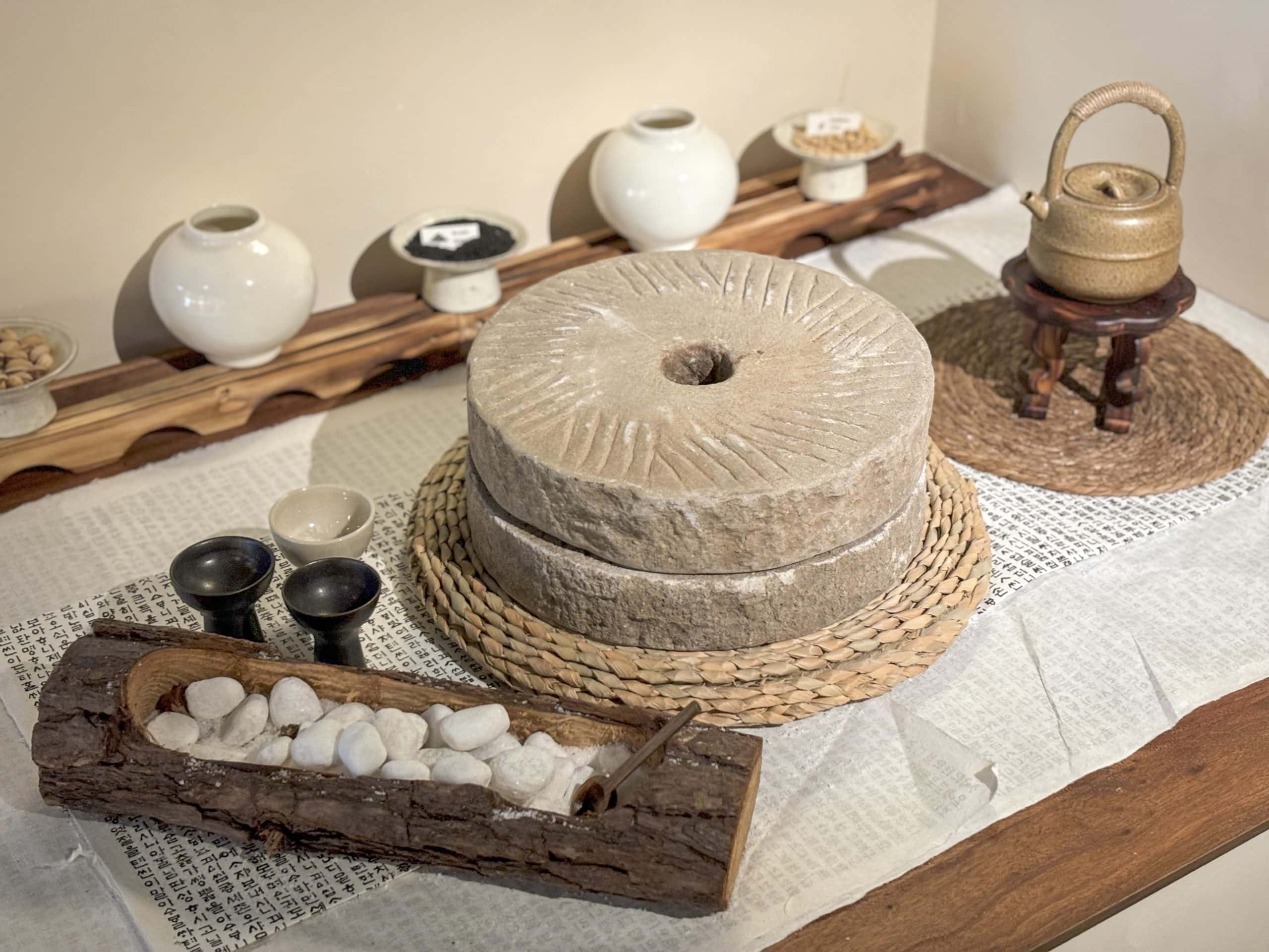
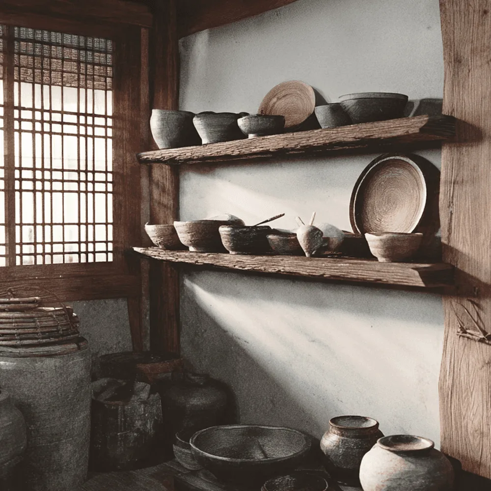 전통 집기Traditional Kitchenware
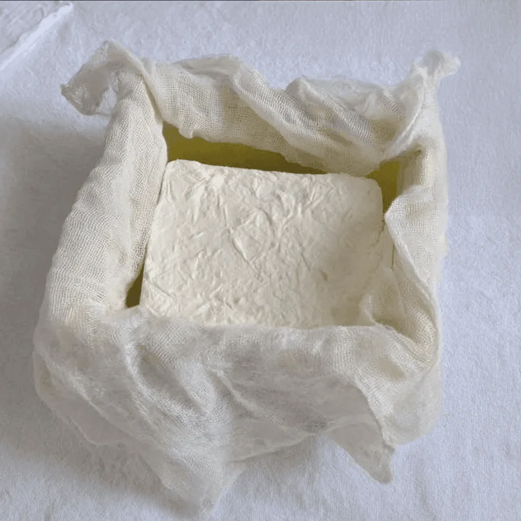 헝겊Unbleached Cotton
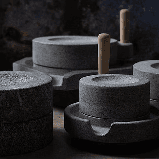 맷돌Millstone
03 — Space
Korean Atelier
린넨, 무표백 면, 원목 마감재로 오차드 로드의 럭셔리 리테일 환경 속에 고요한 한국의 주방을 구현했습니다.
With linen, unbleached cotton, and wood finishes, a serene Korean kitchen was brought to life within Orchard Road's luxury retail environment.
1호점
Store 01
Mandarin Gallery
싱가포르 오차드 로드 만다린 갤러리 #03-30, 싱가포르 최초의 프레시 처닝 프리미엄 두부 젤라또. 맷돌·전통 주방·Test Zone·VMD의 공간 언어가 처음으로 하나의 공간에 완성된 1호점입니다.
333A Orchard Rd, #03-30 Mandarin Gallery — Singapore's first fresh-churned premium tofu gelato, where the spatial language of millstone, kitchen, Test Zone and VMD first came together as one space.
Design Process
컨셉 스케치부터 3D 모델링, 마감재 선정, 최종 시공까지 — 1호점을 실제 공간으로 완성한 과정.
From concept sketches to 3D modeling, material selection, and final construction — how the first store became a real space.
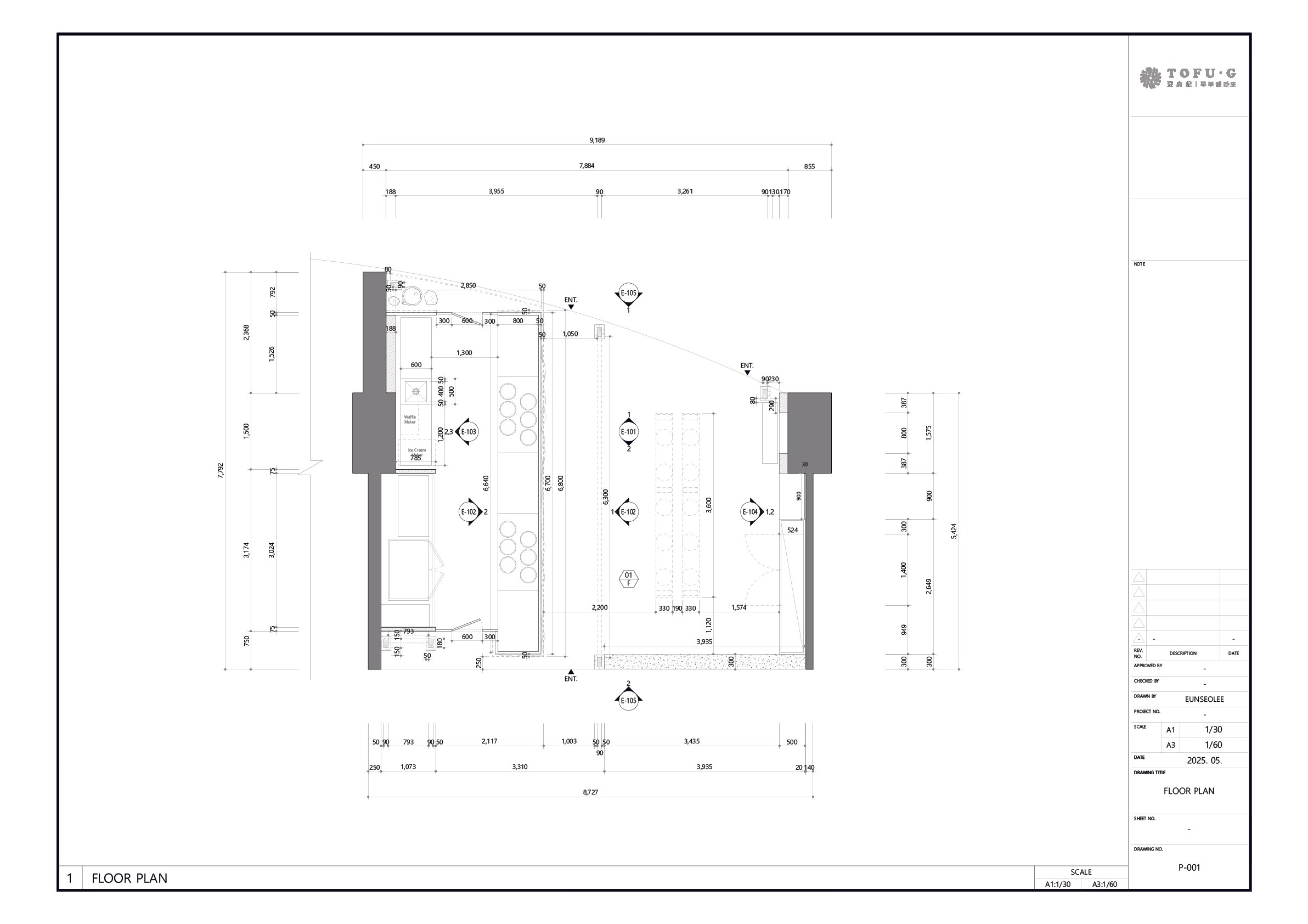
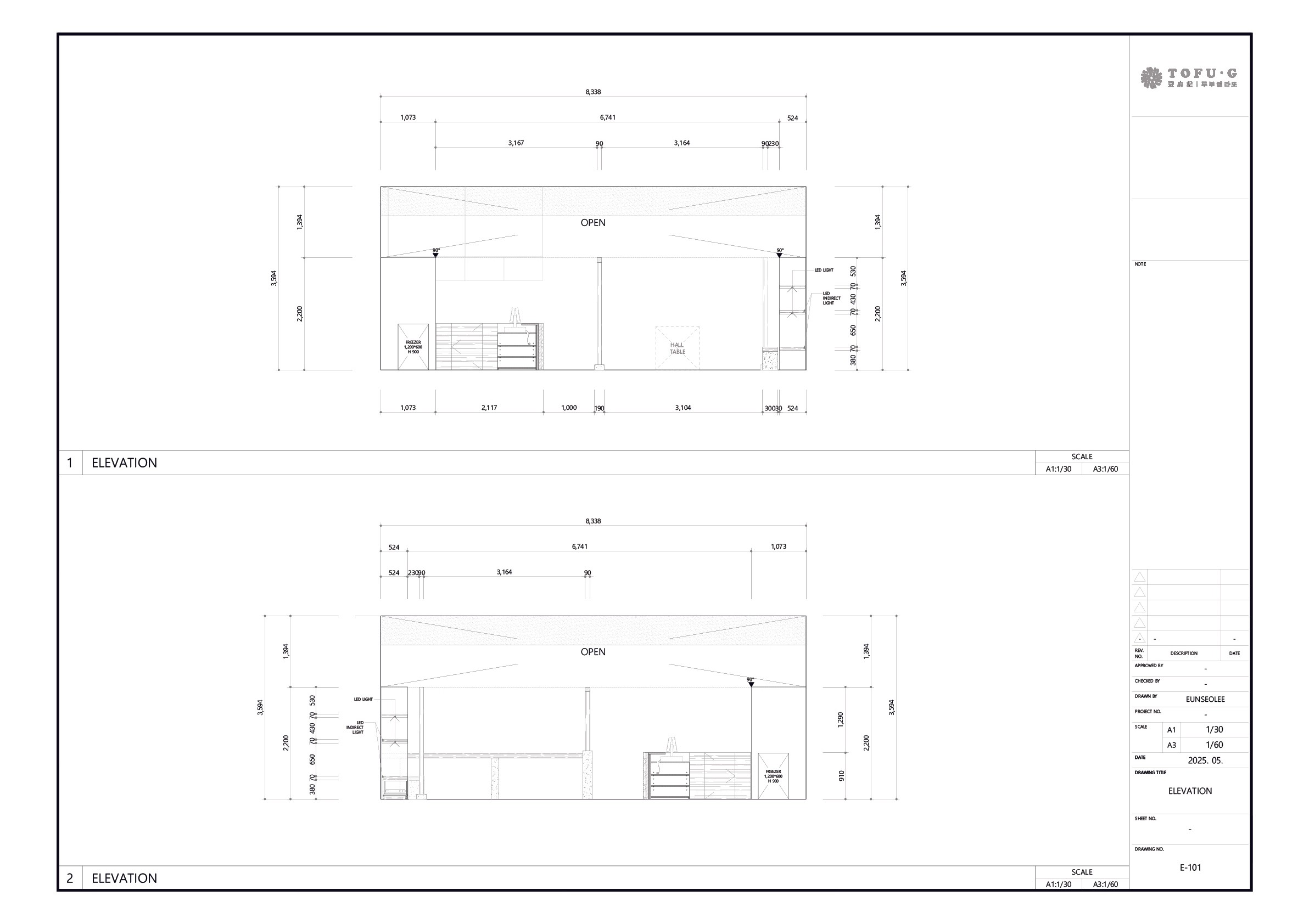
Floor Plan · Elevation
1호점 공간을 기준으로 작성한 평면도와 입면도 — 이후 전 매장에 적용된 브랜드 공간 가이드의 기준이 되었습니다.
Floor plan and elevation based on the first store — the reference for the brand spatial guide later applied across all stores.
싱가폴 2~4호점
Singapore Stores 2–4
1호점에서 완성한 공간 언어를 이어받은 매장들. 대표 컷을 클릭하면 매장 공간 사진을 팝업으로 볼 수 있습니다.
Stores carrying forward the spatial language established at the first store. Click a store to open its space photos.
공통 디자인 디테일 · 1~4호점
Design Language · Stores 1–4
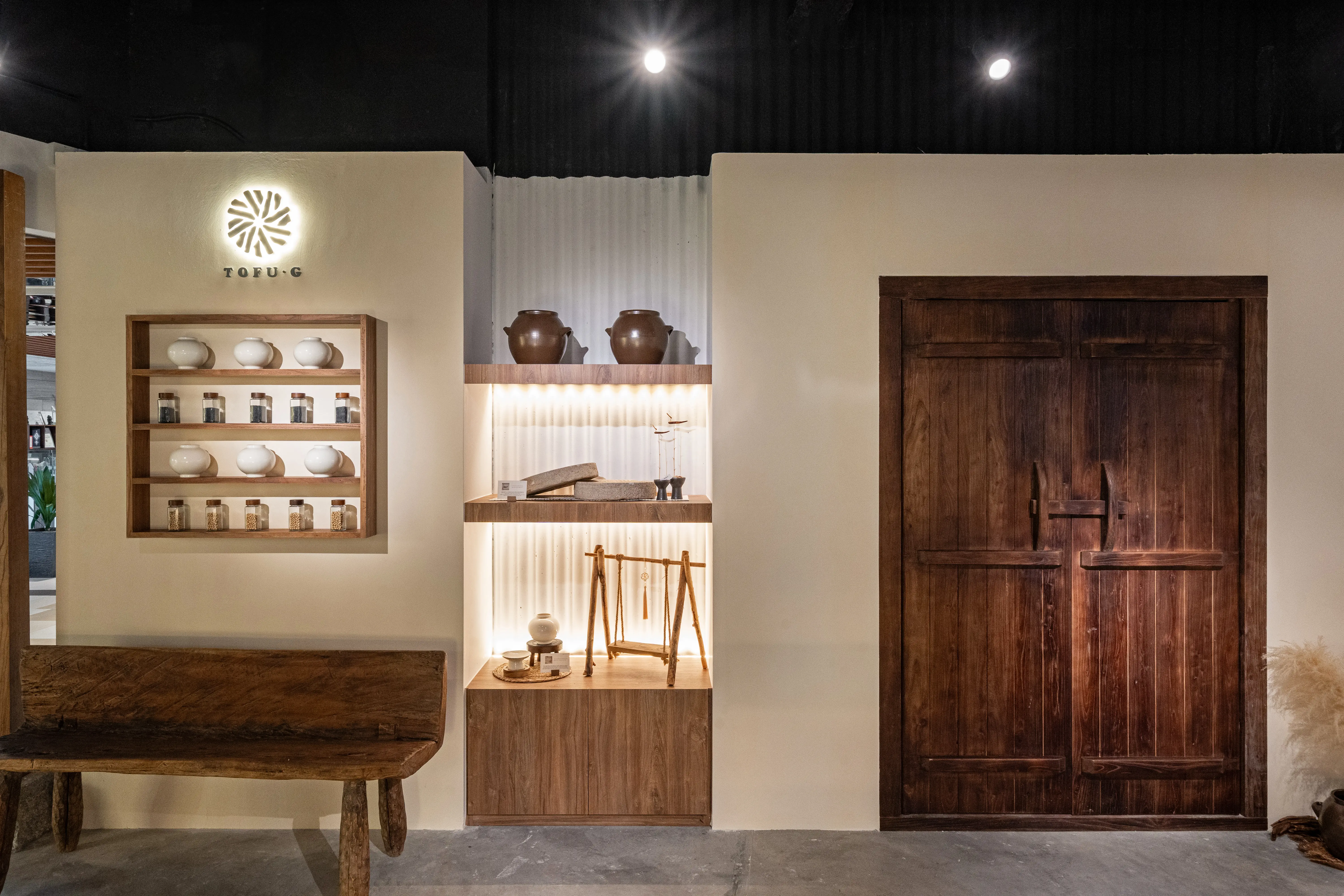
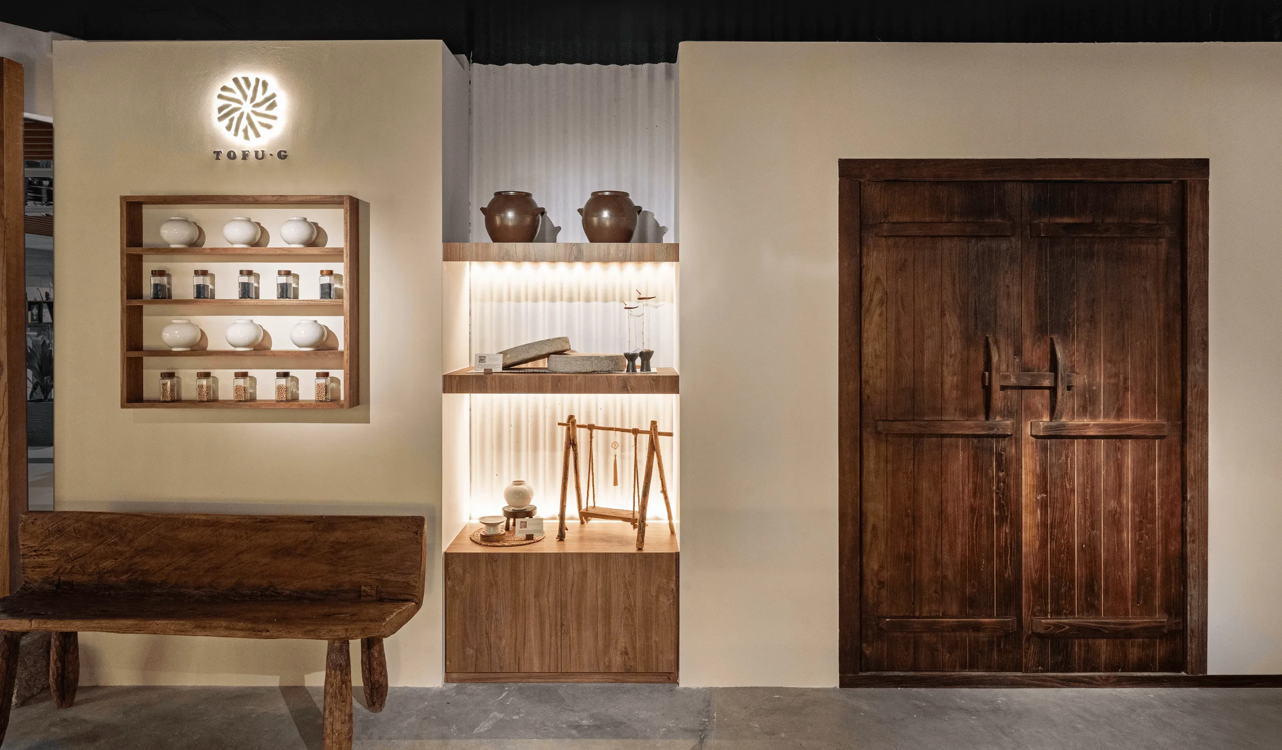
린넨·무표백 면·원목 마감과 맷돌 모티프 — 1호점에서 정립해 전 매장에 공통으로 흐르는 공간 언어입니다.
Linen, unbleached cotton, wood finishes and the millstone motif — the spatial language defined at the first store and shared across every store.
전통 주방에서 영감받은 공간
Traditional Kitchen-Inspired Space
전통 음식은 그 나라의 문화를 닮습니다. 그 음식이 만들어지는 주방은, 한중일 전통 가옥 중에서도 문화의 결이 가장 선명하게 배어나는 공간입니다.
Traditional food mirrors its country's culture, and the kitchen where it is made is where cultural texture is most vividly felt — even among the traditional houses of Korea, China, and Japan.
맷돌 — 디자인 모티프
Millstone — Design Motif
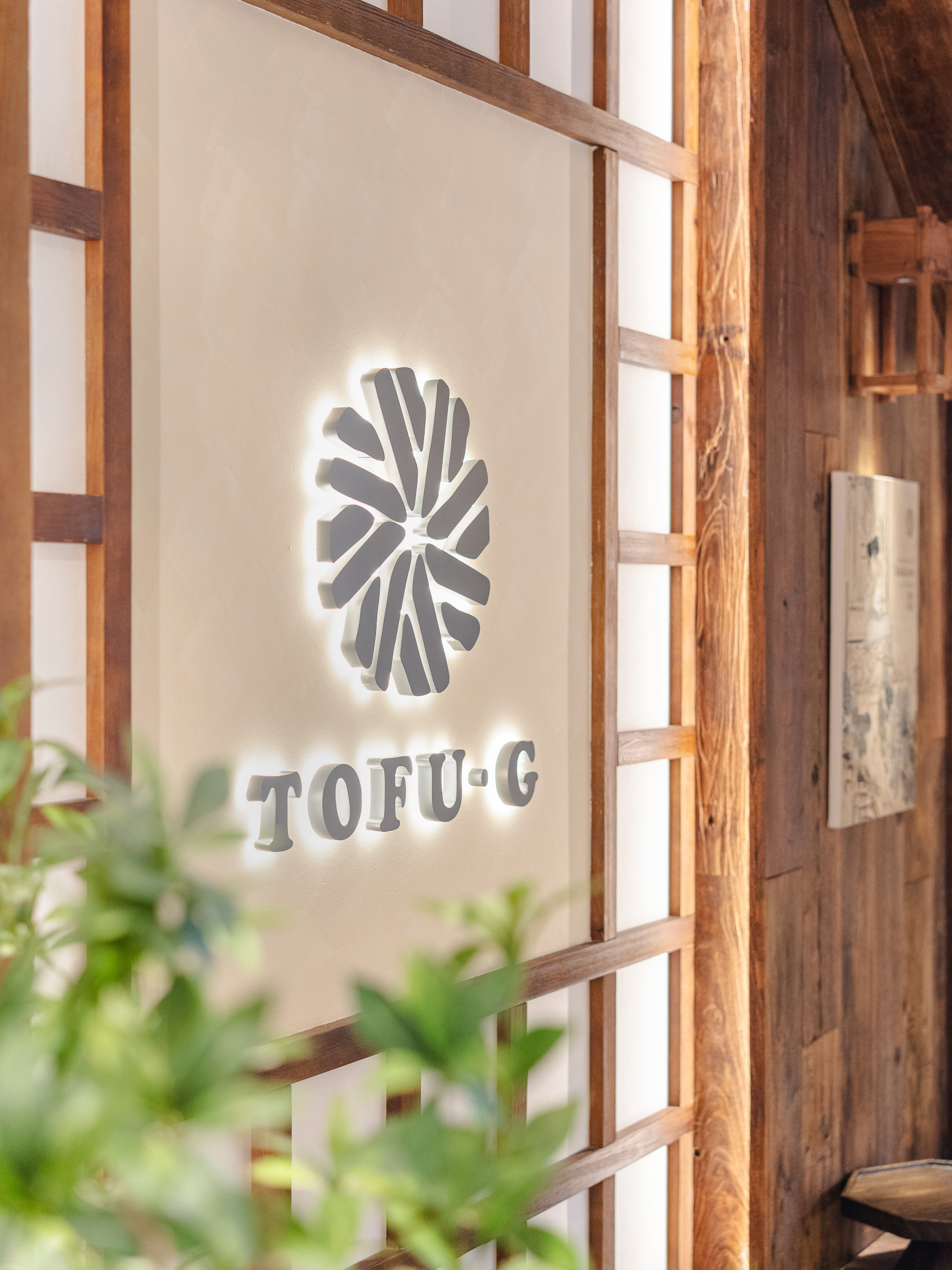
콩을 갈아 두부를 만들던 맷돌의 형상을 공간과 브랜딩의 핵심 모티프로 활용했습니다. 로고, 조명, 컵 디자인까지 맷돌의 원형 패턴이 일관되게 적용됩니다.
The millstone — once used to grind soybeans into tofu — is the core motif across space and branding. From logo and lighting to cup design, the circular pattern is applied consistently.
체험존 — Test Zone
Experience Zone — Test Zone
인절미, 쑥, 말차 가루를 직접 체험할 수 있는 Test Zone을 제안했습니다. 외국인에게 생소할 수 있는 한국의 전통 향을 간접적으로 알리는 감각적 체험 공간입니다.
A Test Zone where visitors experience injeolmi, mugwort, and matcha powders firsthand — a sensory space introducing traditional Korean aromas that may be unfamiliar to international visitors.
VMD — 천과 맷돌의 재해석
VMD — Reinterpreting Cloth & Millstone
맷돌에서 콩이 갈리는 모습을 얇은 천으로 표현한 VMD 디자인을 제안하고, 전통 맷돌을 현대적 디스플레이 테이블로 재해석해 공간의 핵심 오브제로 구현했습니다.
A VMD design expressing soybeans grinding through delicate fabric draping — reinterpreting the millstone as a modern display table as the central spatial object.
04 — Expansion
브랜드 여정 — 시스템이 국경을 넘다
The Journey — a System Crossing Borders
싱가폴 4개 매장은 직접 설계·시공했고, Malaysia · Indonesia는 그 SI 가이드라인으로 브랜드가 확장한 사례입니다.
The 4 Singapore stores were designed and built directly; Malaysia · Indonesia are brand expansions built on that SI guideline.
브랜드 현황 · 라이브Brand Footprint · LiveAs of 2025.11 · 확장 중& growing
0
Malaysia
브랜드 확장Brand expansion
soon
Indonesia
브랜드 확장 · 예정Brand expansion · soon
02Malaysia
1개 매장 · 2025.111 store · 2025.11
MODU · TRXKuala Lumpur
03Indonesia
오픈 예정Coming soon
IndonesiaJakarta오픈 예정Soon