BENSON_Hanwha Galleria
Fortune Global 500 기업 한화갤러리아의 신규 F&B 브랜드 BENSON. 신규 브랜드의 플래그십 공간을 디자인하고 SI 가이드북을 제작했습니다.BENSON, a new F&B brand by Hanwha Galleria — a Fortune Global 500 company. We designed the flagship space and produced the SI guidebook for the new brand.
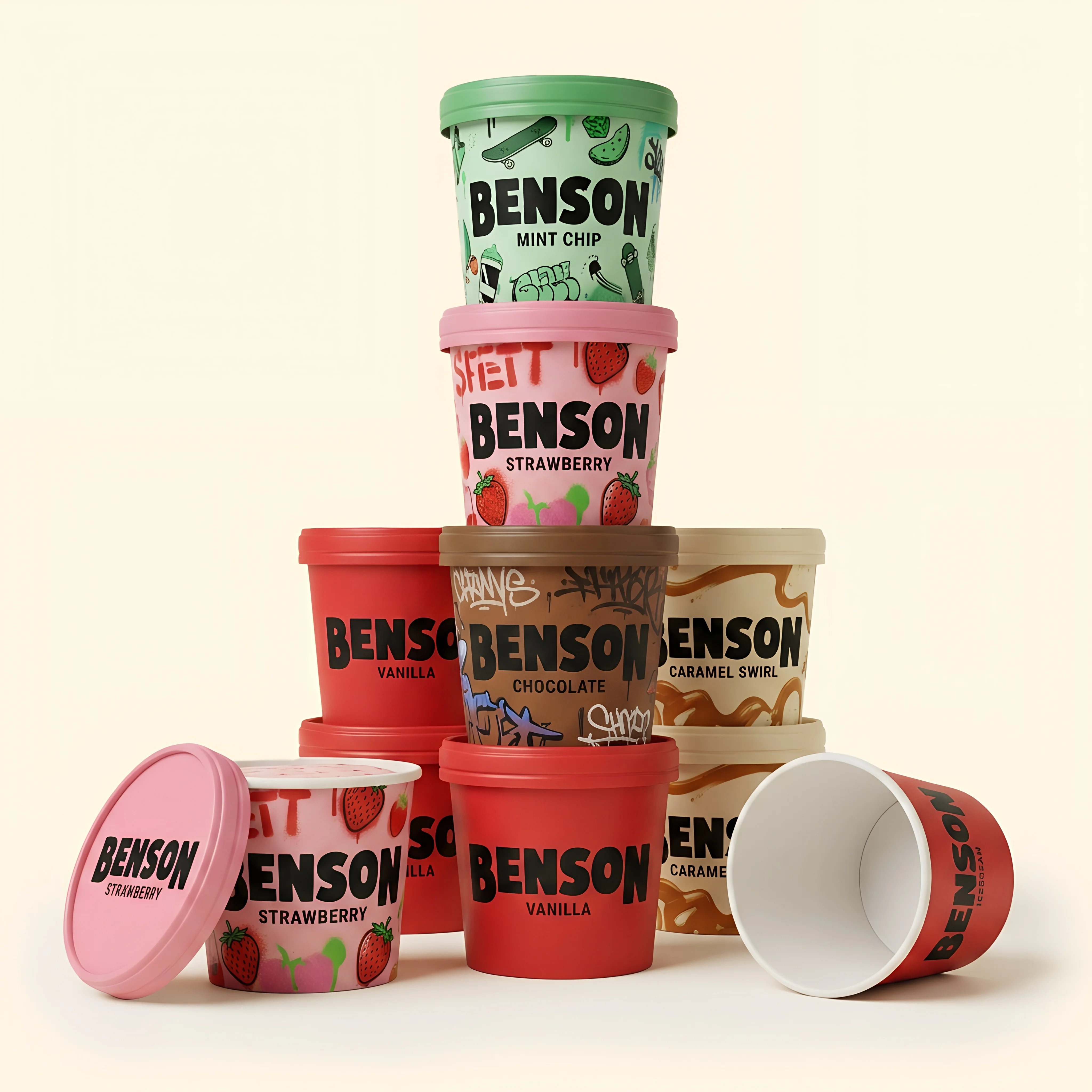
볼드한 토핑과 풍부한 유지방의 깊은 맛이 감각을 깨우는 곳. 벤슨(BENSON)은 미국의 서브컬처와 스트릿 무드가 교차하며 만들어내는 역동적인 순간을 담았습니다.
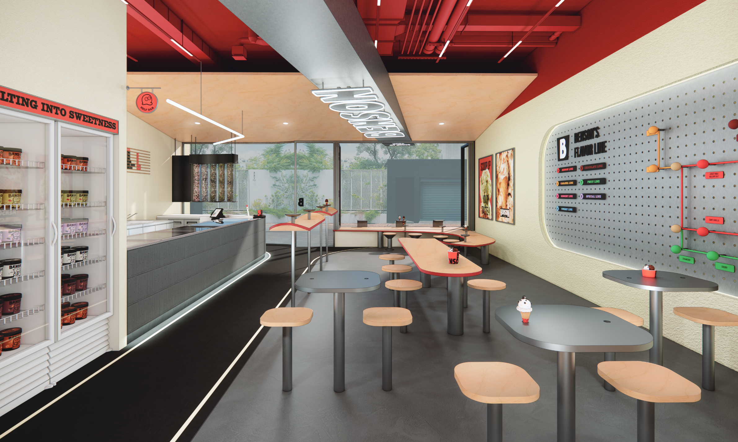
스케이트 파크의 에너지에서 시작된 대담한 곡선, 거친 콘크리트 위로 맥박처럼 흐르는 시그니처 레드. 파사드에서 내부로 이어지는 곡선형 퍼니처와 천장 조형물이 경계를 허물며, 당신을 자유로운 아웃도어 무드로 이끕니다. 이곳에서 아이스크림 한 스쿱은 단순한 디저트가 아닙니다 — 부드러운 텍스처와 청키한 토핑이 입안에서 리듬을 만들 때, 당신은 이 역동적인 세계의 일부가 됩니다.Where bold toppings and rich, full-bodied depth awaken the senses. BENSON captures the dynamic moments born where American subculture meets street mood.
Daring curves inspired by the energy of the skate park; a signature red pulsing like a heartbeat across raw concrete. Flowing furniture and sculptural ceiling forms carry from the façade into the interior, dissolving boundaries and drawing you into a free, outdoor mood. Here, a single scoop of ice cream is more than dessert — as soft textures and chunky toppings create rhythm on your palate, you become part of this dynamic world.
“당신이 마주하는 이 모든 역동성이 곧 벤슨의 맛이다.”“All the energy you encounter — that is the taste of BENSON.”
Work Scope
공간 디자인 · SI 가이드북 제작Space Design · SI Guidebook
Project Type
신규 F&B 브랜드 · 플래그십 컨셉New F&B Brand · Flagship Concept
Partner
CLIENT | 한화갤러리아 — 한화그룹 (Fortune Global 500)CLIENT | Hanwha Galleria — Hanwha Group (Fortune Global 500)AGENCY | 스프레드웍스AGENCY | Spreadworks




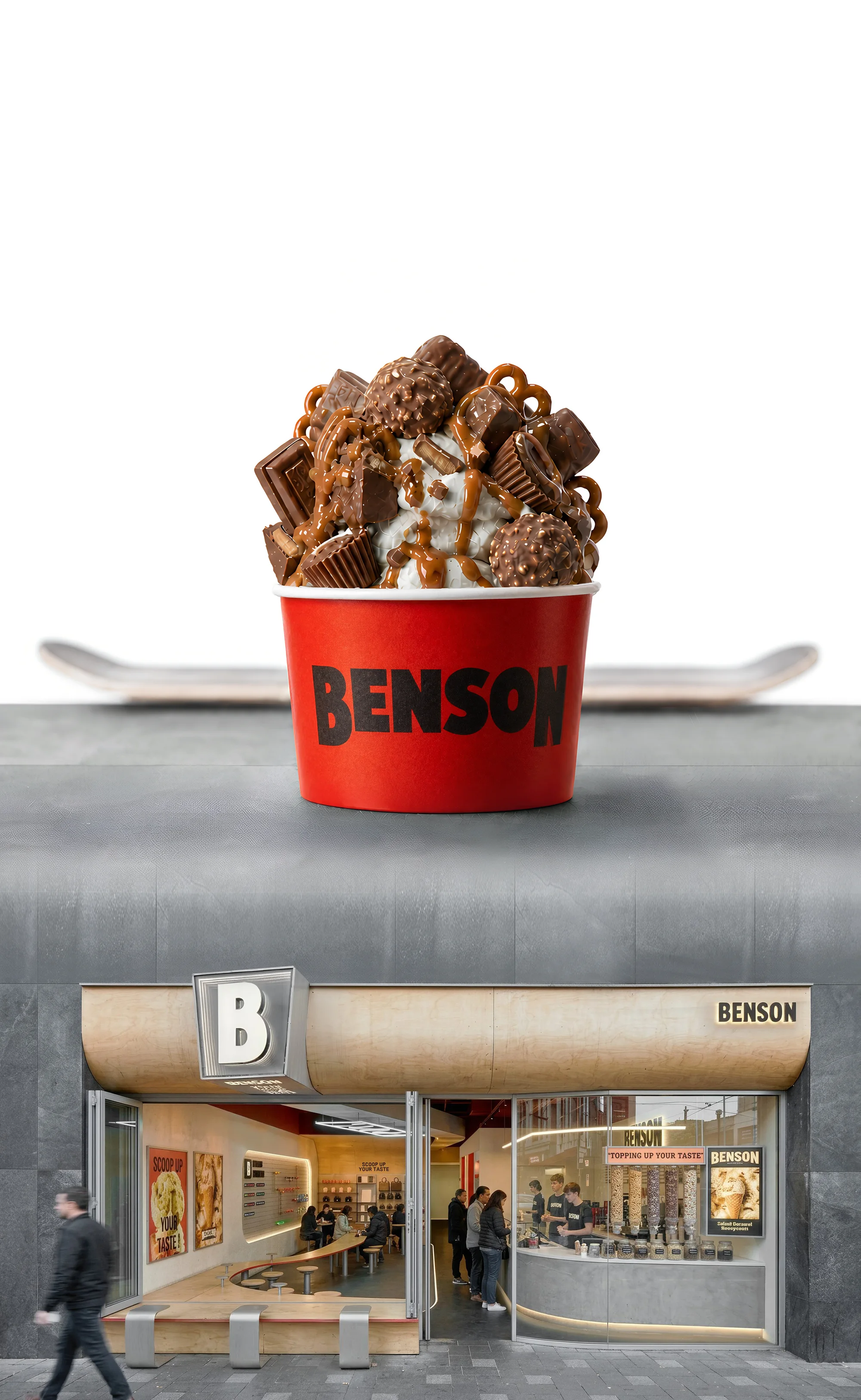
Benson
scoops
the street
다이내믹한 플레이버, 볼드한 토핑, 진한 유지방이 만드는 묵직한 부드러움 — 스케이트 파크의 곡선을 한 스쿱에 담았습니다.Dynamic flavors, bold toppings, and rich butterfat folded into a heavy, melting softness — the curves of a skatepark caught in a single scoop.




CONCRETE, STREET, FLAVOR, CURVE
BOLD, RAW, RED, RHYTHM
SCOOP, SUBCULTURE
SKATE, TASTE
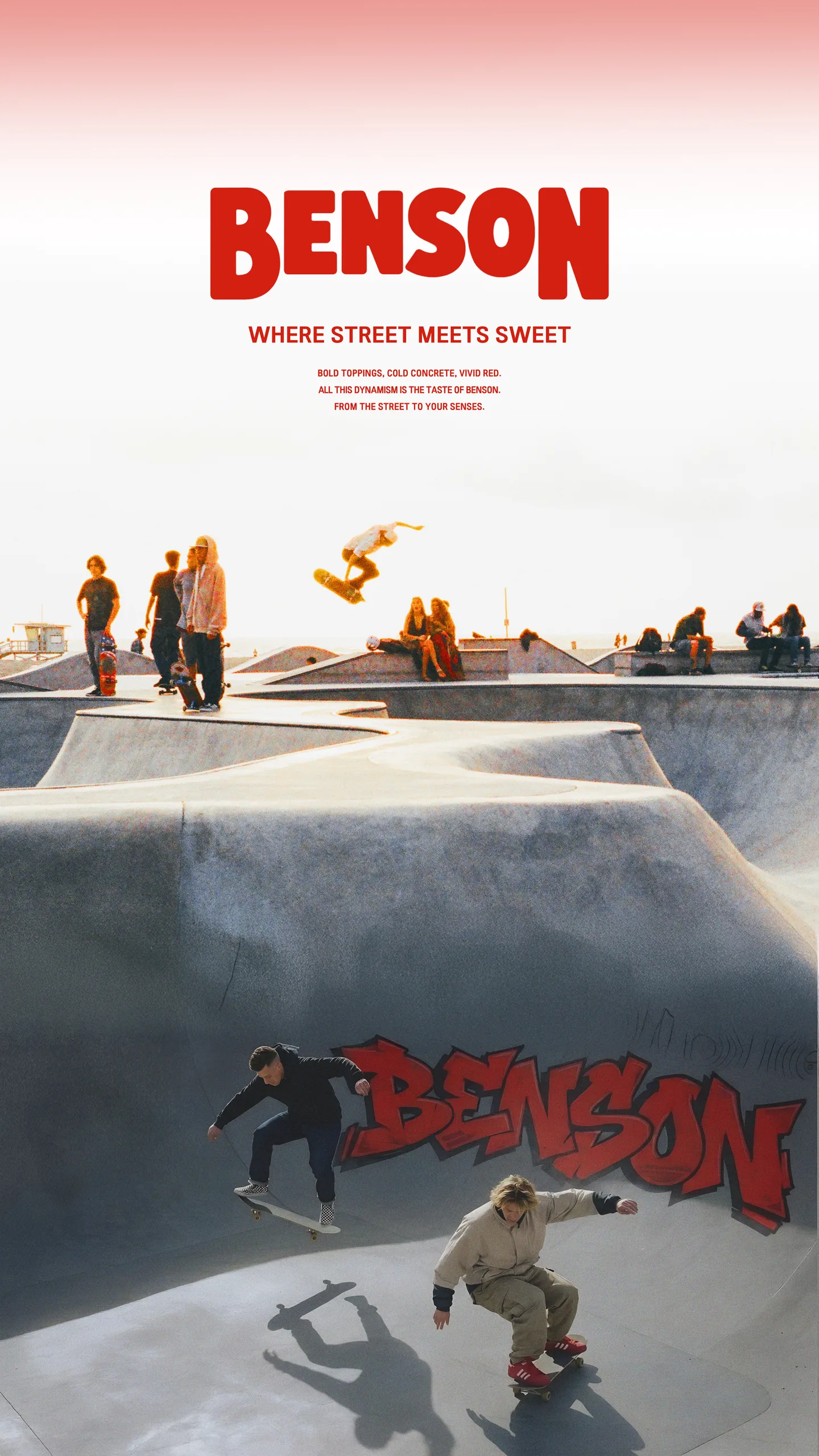
BOLD TOPPINGS, COLD CONCRETE, VIVID RED.
볼드한 토핑과 차가운 콘크리트가 만들어내는 공간
붉은 아이스크림 한 입의 역동성이 만드는 미감
DYNAMIC NARRATIVE — ALL THIS DYNAMISM IS THE TASTE OF BENSON.
한 스쿱의 자유로움. FROM THE STREET TO YOUR SENSES.
SIGNATURE ELEMENT
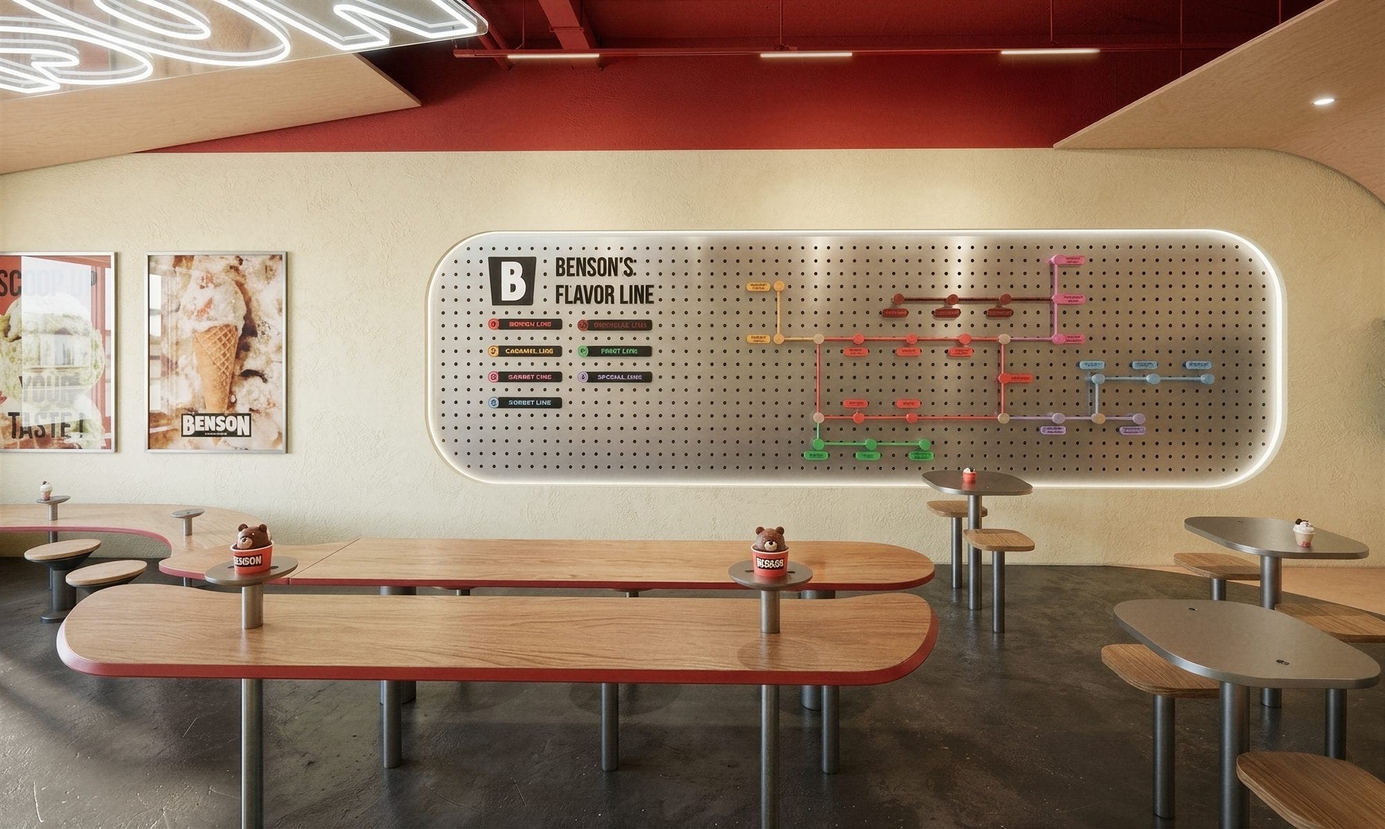
FLAVOR LINE
A SUBWAY MAP OF TASTE
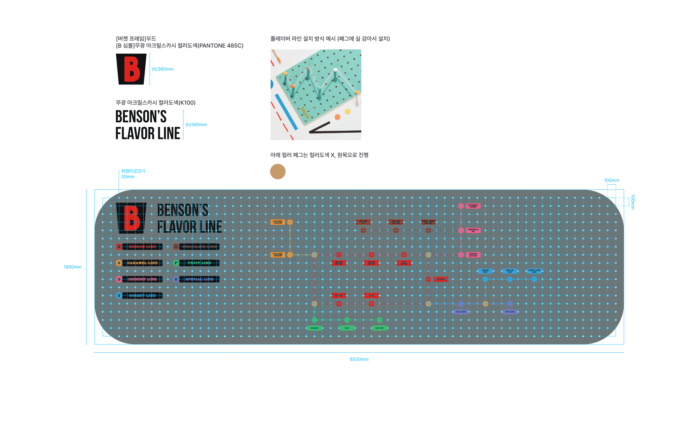
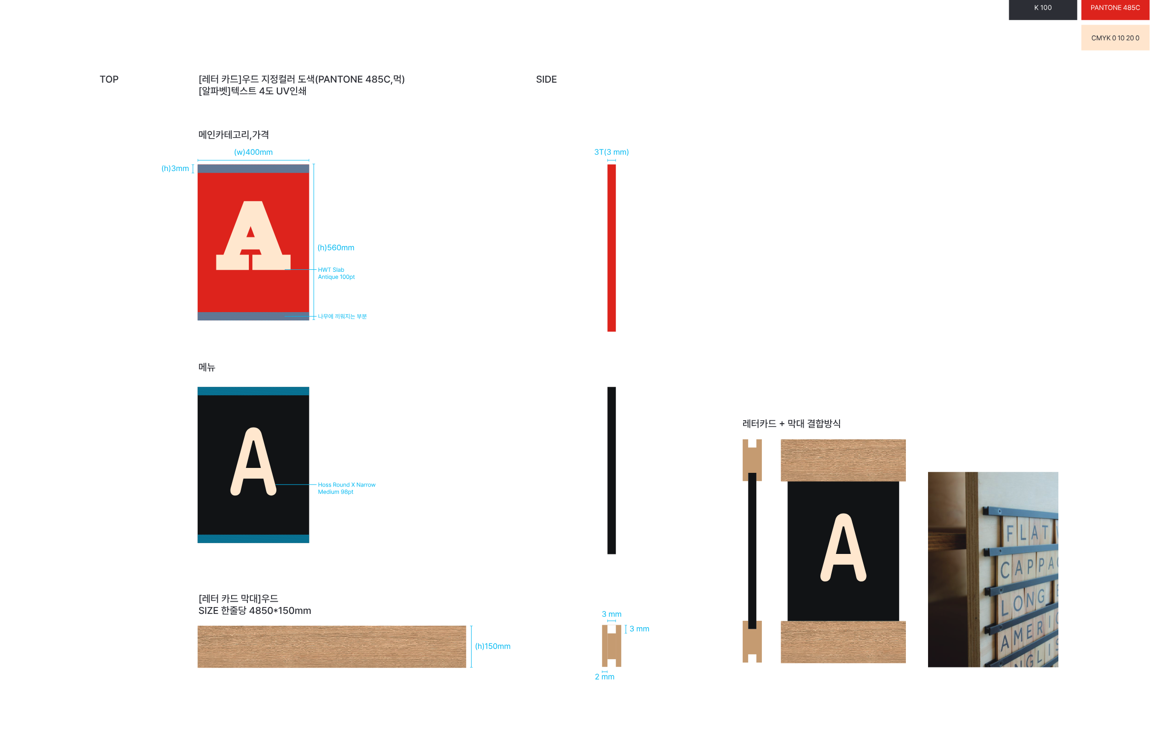
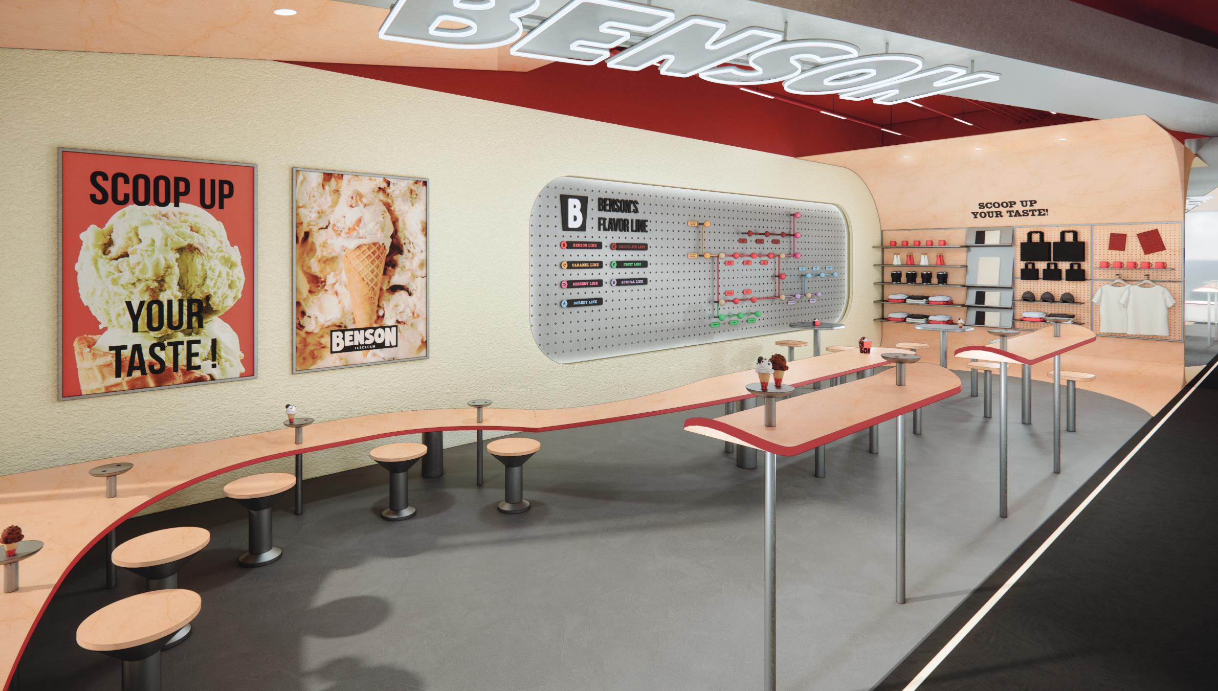
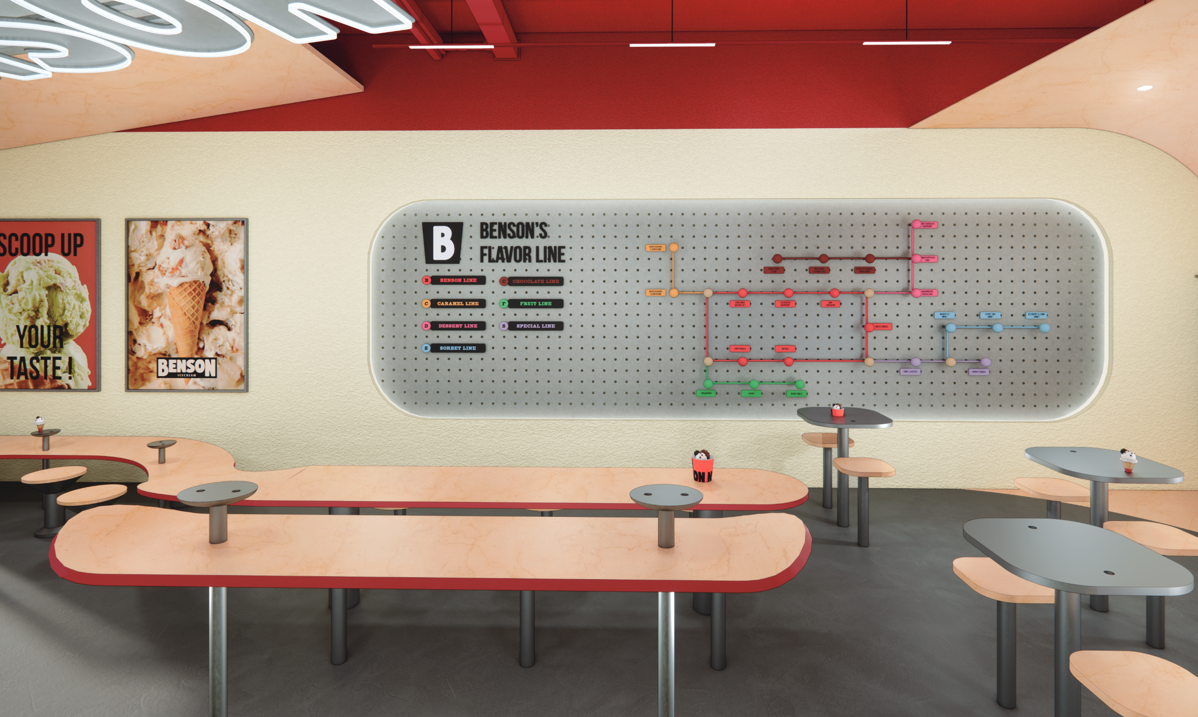
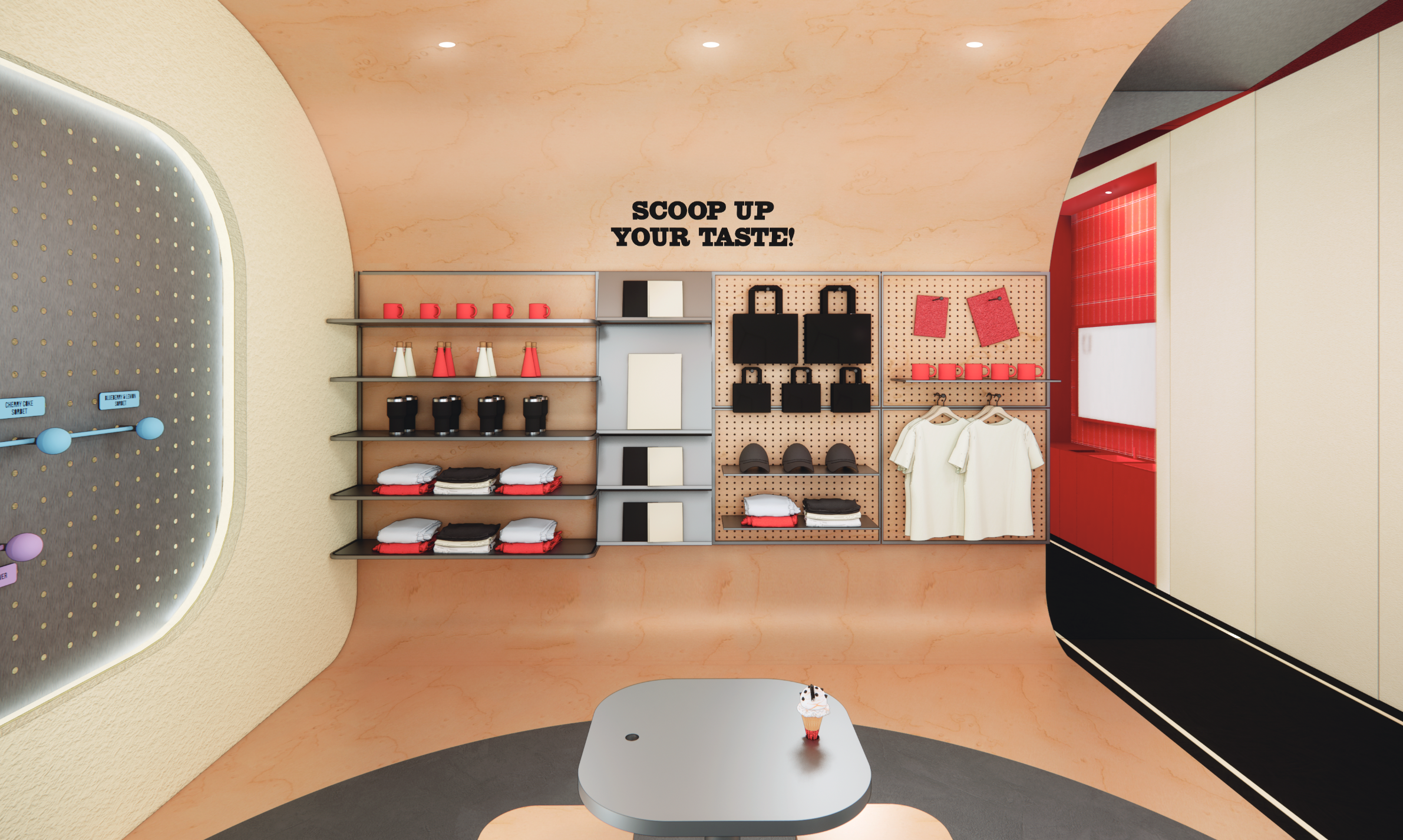
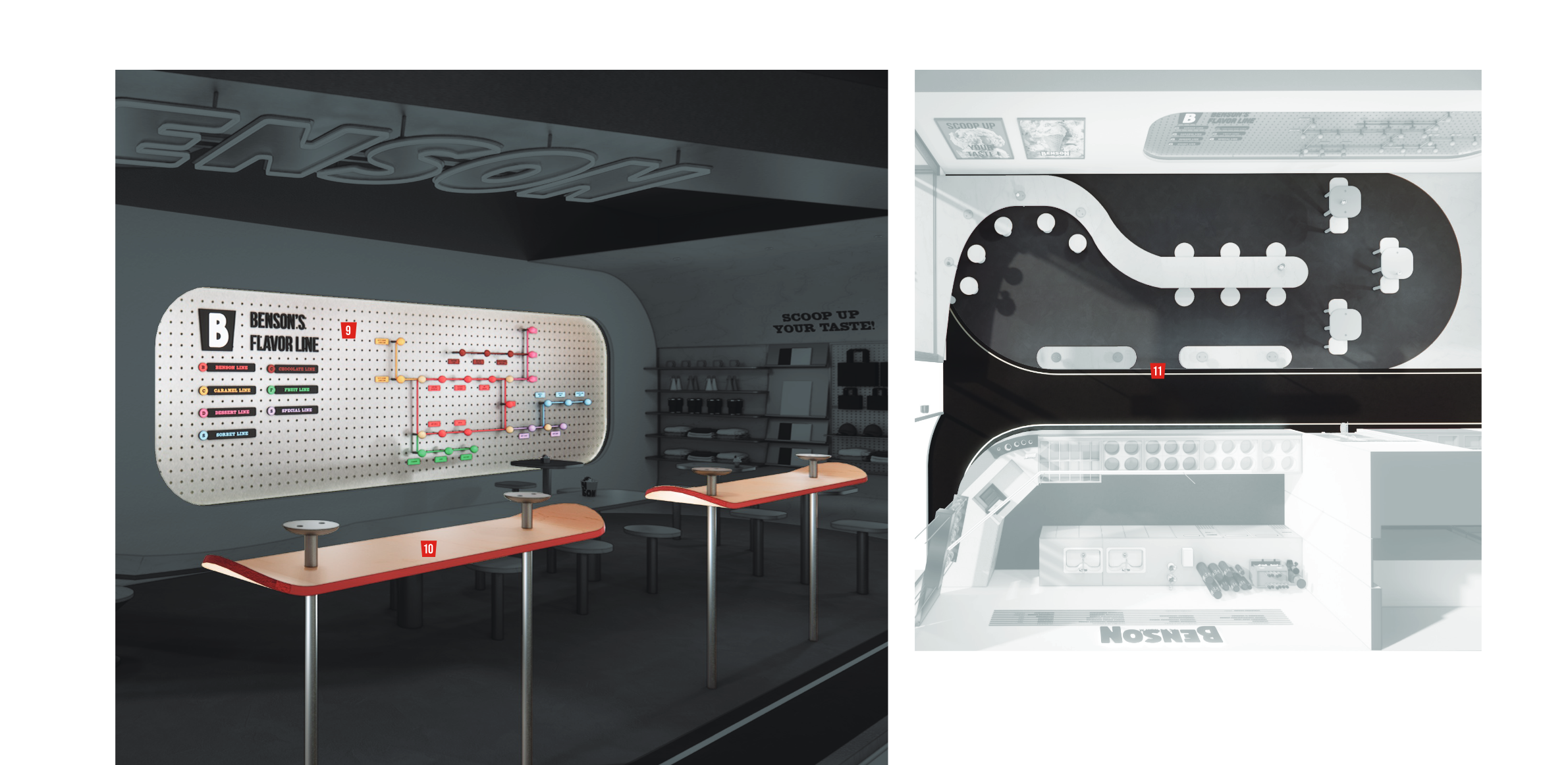
벤슨의 플레이버 라인은 공간의 서사적 중심이 되는 작품으로, 스틸 타공 보드를 지하철 노선도의 형식으로 재해석하여 각 정거장에는 플레이버를, 각 라인에는 맛의 카테고리를 부여한다. 미국 서브컬처의 자유로운 언어와 스케이트 파크의 열린 기하학에서 출발한 이 거대한 페그보드는, 만지고 읽고 발견하게 만드는 인터랙티브한 그래픽 월이다. 역동적인 노선들은 단순한 메뉴 선택을 하나의 탐험으로 바꾸어 놓으며, 설명 없이도 브랜드의 캐릭터를 말하는 벽으로 자리한다.
Benson's Flavor Line is the narrative centerpiece of the space — a pegboard wall reinterpreted as a subway map, where each station is a flavor and each line is a family of taste. Inspired by the freewheeling language of American sub-culture and the open geometry of skate parks, the perforated metal field invites touch, reading, and discovery. Its dynamic pathways turn ordering ice cream into an act of exploration — a wall that explains the brand without ever asking to be read.
01 — Design Strategy
Authentic American
Street Dessert
벤슨 아이스크림 샵은 벤슨이 전개하는 미국스타일 아이스크림의 다이내믹한 플레이버, 볼드한 토핑, 풍부한 유지방이 만들어내는 부드러움을 미국의 서브컬쳐를 모티브로 풀어낸 공간입니다.
The Benson Ice Cream shop is a space that channels the dynamic flavors, bold toppings, and rich creaminess of American-style ice cream through the lens of American subculture.
02 — Facade
Storefront Design
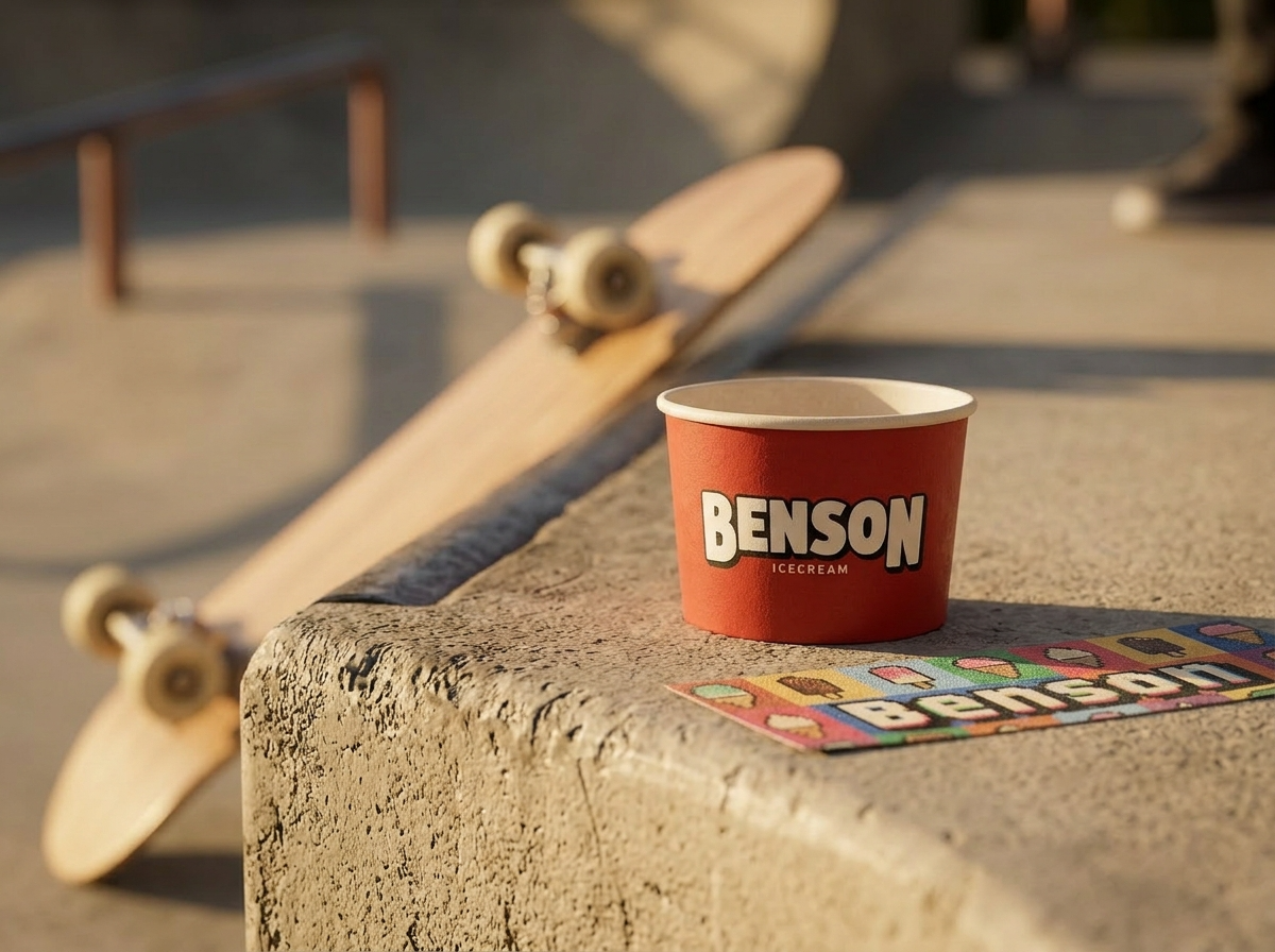
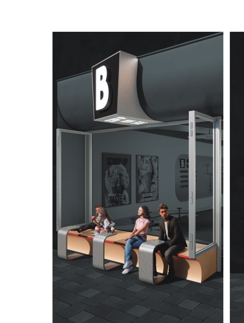
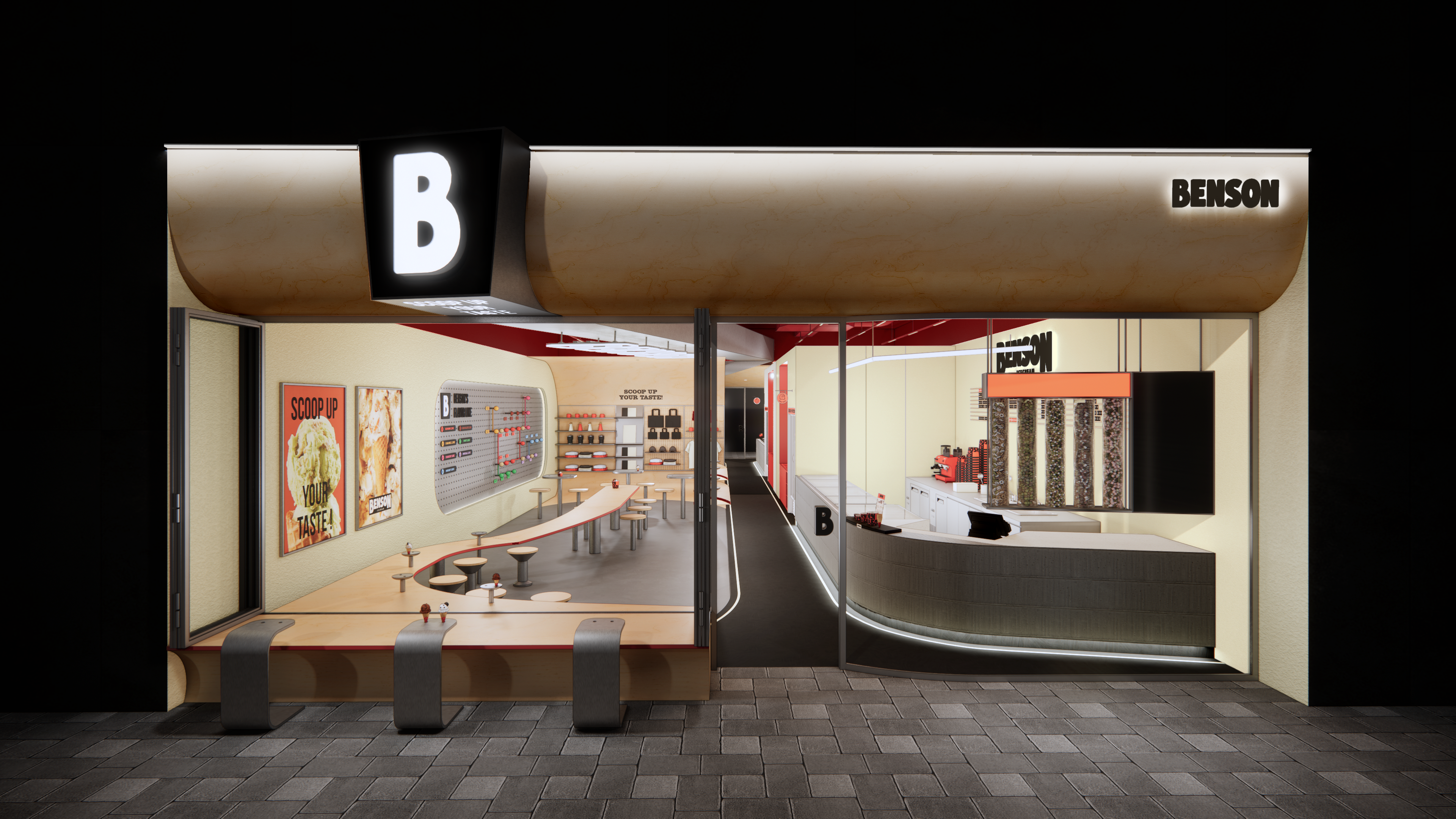
폴딩도어와 전면 곡선으로 부드럽게 이어지는 파사드 구조물로 내외부를 연결하여 접근성을 높이고, 스트릿 푸드가 가진 자유로움과 활기참을 표현하였습니다.
Folding doors and a gently curving facade structure seamlessly bridge the interior and exterior, enhancing accessibility while embodying the freedom and vibrancy of street food culture.
03 — Perspectives
Interior Views
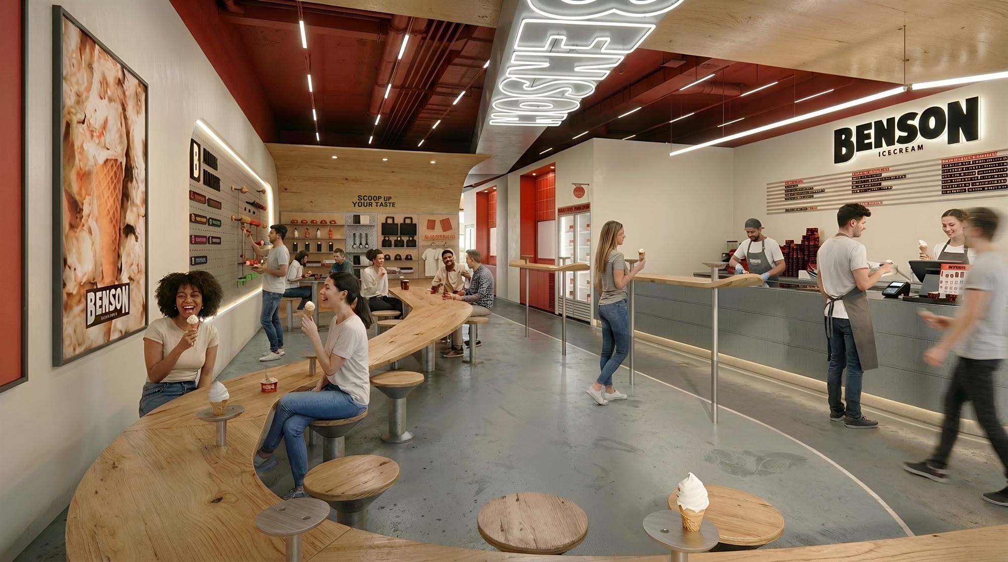
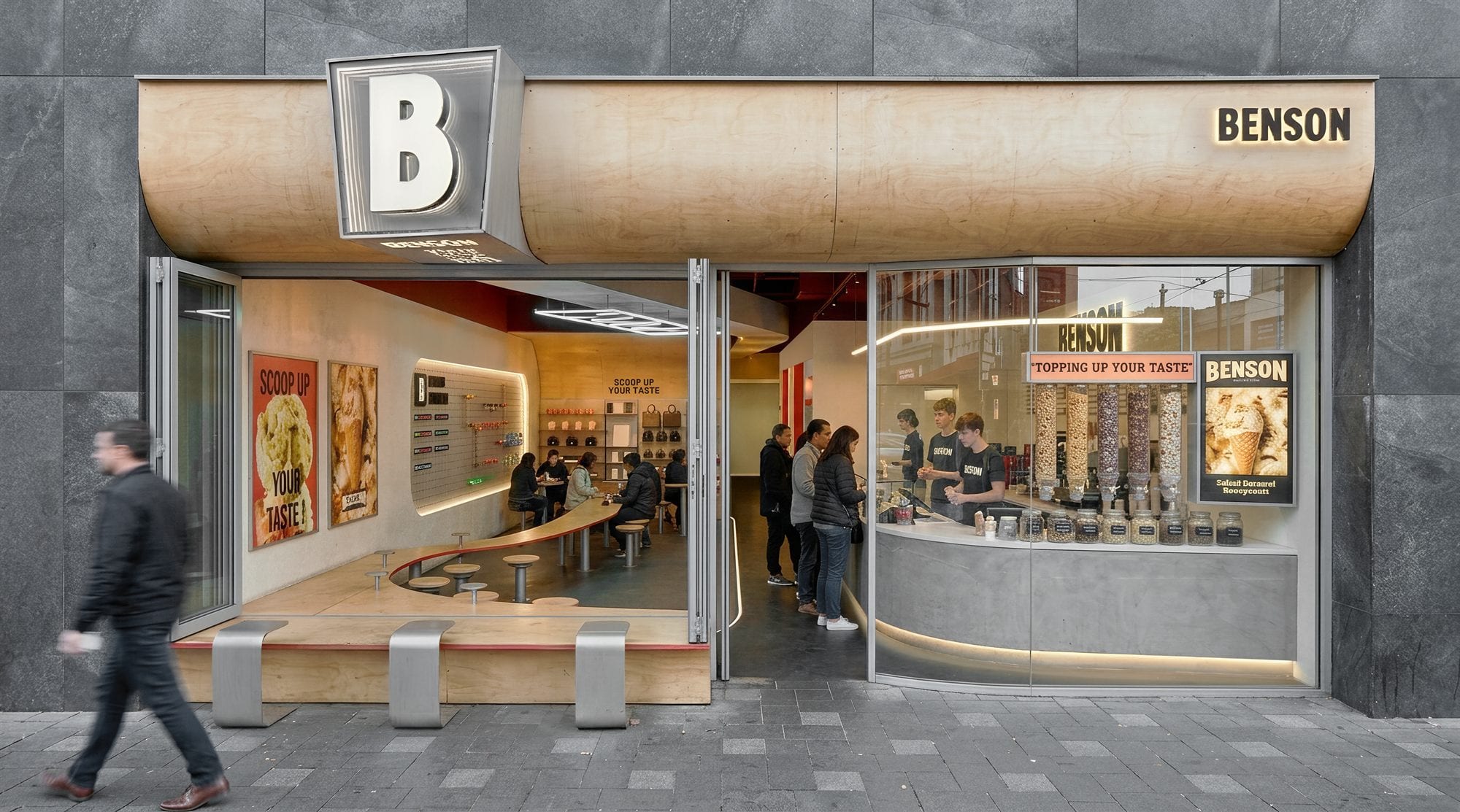
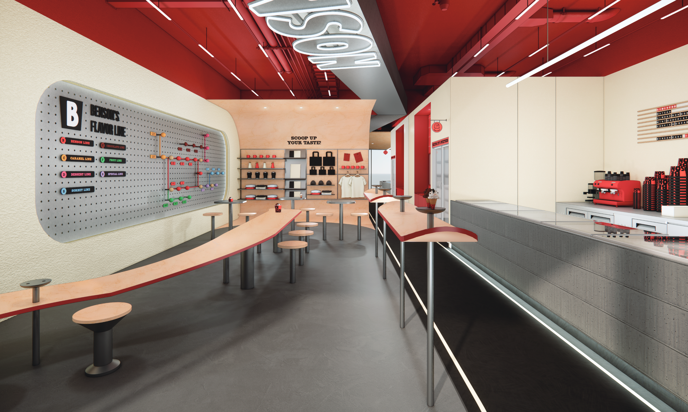
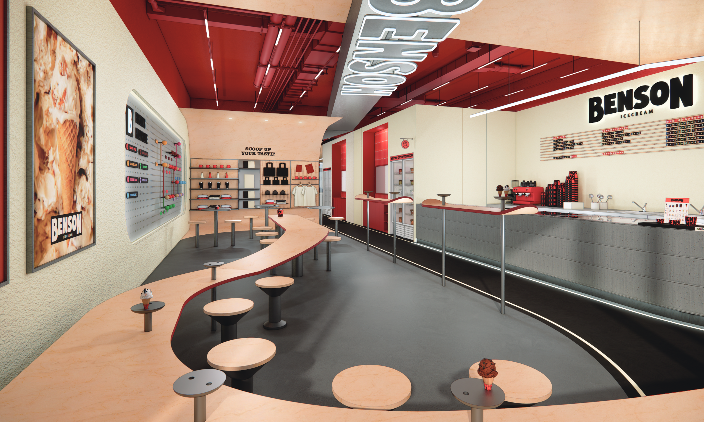
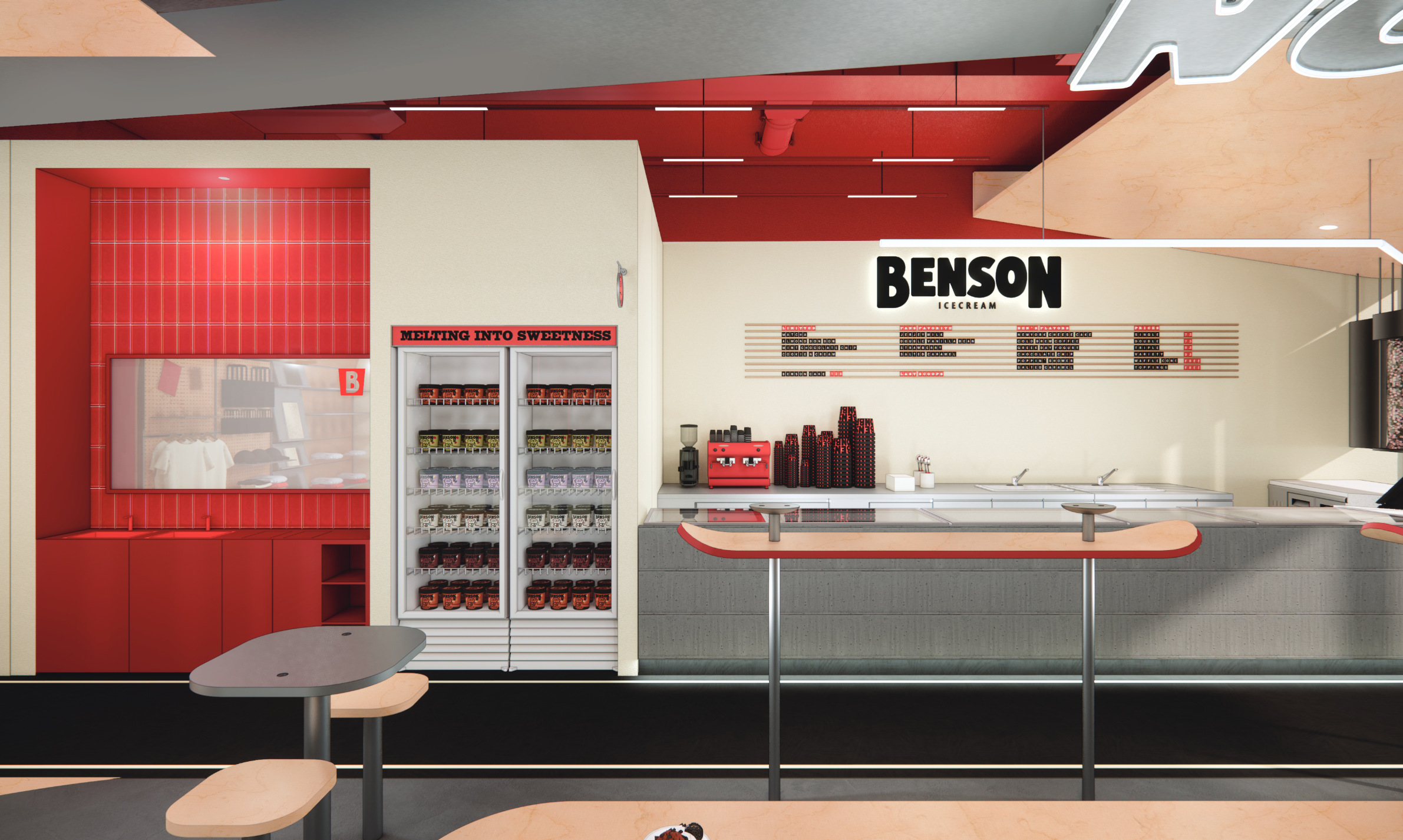
곡선형 메인 퍼니처와 레드 포인트 컬러가 어우러진 역동적인 내부 공간
A dynamic interior where curvilinear main furniture meets bold red accent colors
04 — Design Concept
Outdoor Zone → Connect Inside
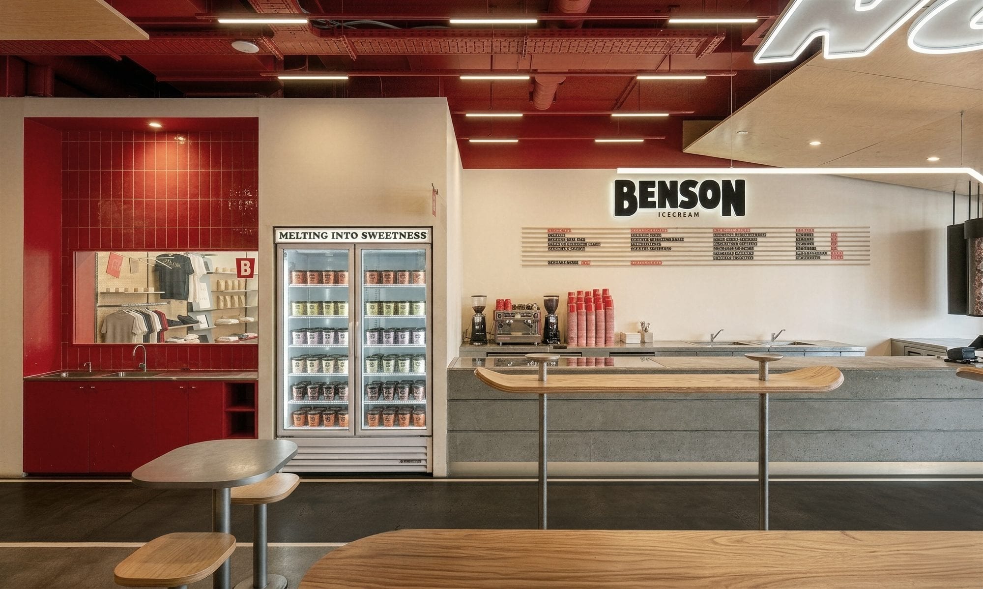
벤슨 아이스크림 샵은 폴딩도어와 전면 곡선으로 부드럽게 이어지는 파사드 구조물, 매장 전체를 관통하는 사이니지, 벤치-테이블로 이어지는 곡선형 메인 퍼니처를 이용해 내외부를 연결함으로써, 내부 뿐 아니라 외부에서도 벤슨 아이스크림을 즐길 수 있는 아웃도어 형태로 디자인하였습니다.
By connecting interior and exterior through folding doors, a gently curving facade, store-spanning signage, and a flowing bench-to-table main furniture piece, the Benson Ice Cream shop is designed as an outdoor-oriented space where guests can enjoy ice cream both inside and out.
 1234
123405 — Design Details
Shape & Motif
06 — Materials
Raw Material
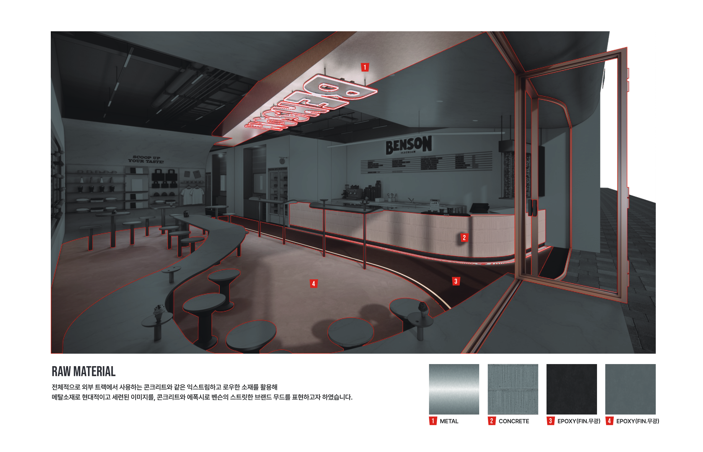
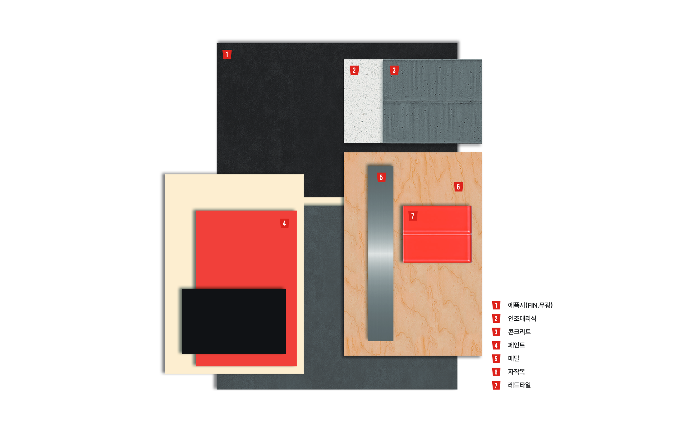
전체적으로 외부 트랙에서 사용하는 콘크리트와 같은 익스트림하고 로우한 소재를 활용해, 메탈소재로 현대적이고 세련된 이미지를, 콘크리트와 에폭시로 벤슨의 스트릿한 브랜드 무드를 표현하였습니다.
Raw, extreme materials like concrete — reminiscent of outdoor skate tracks — are paired with metal for a modern, refined image, while concrete and epoxy finishes convey Benson's street-inspired brand mood.
07 — Color
Benson Red
Color Point
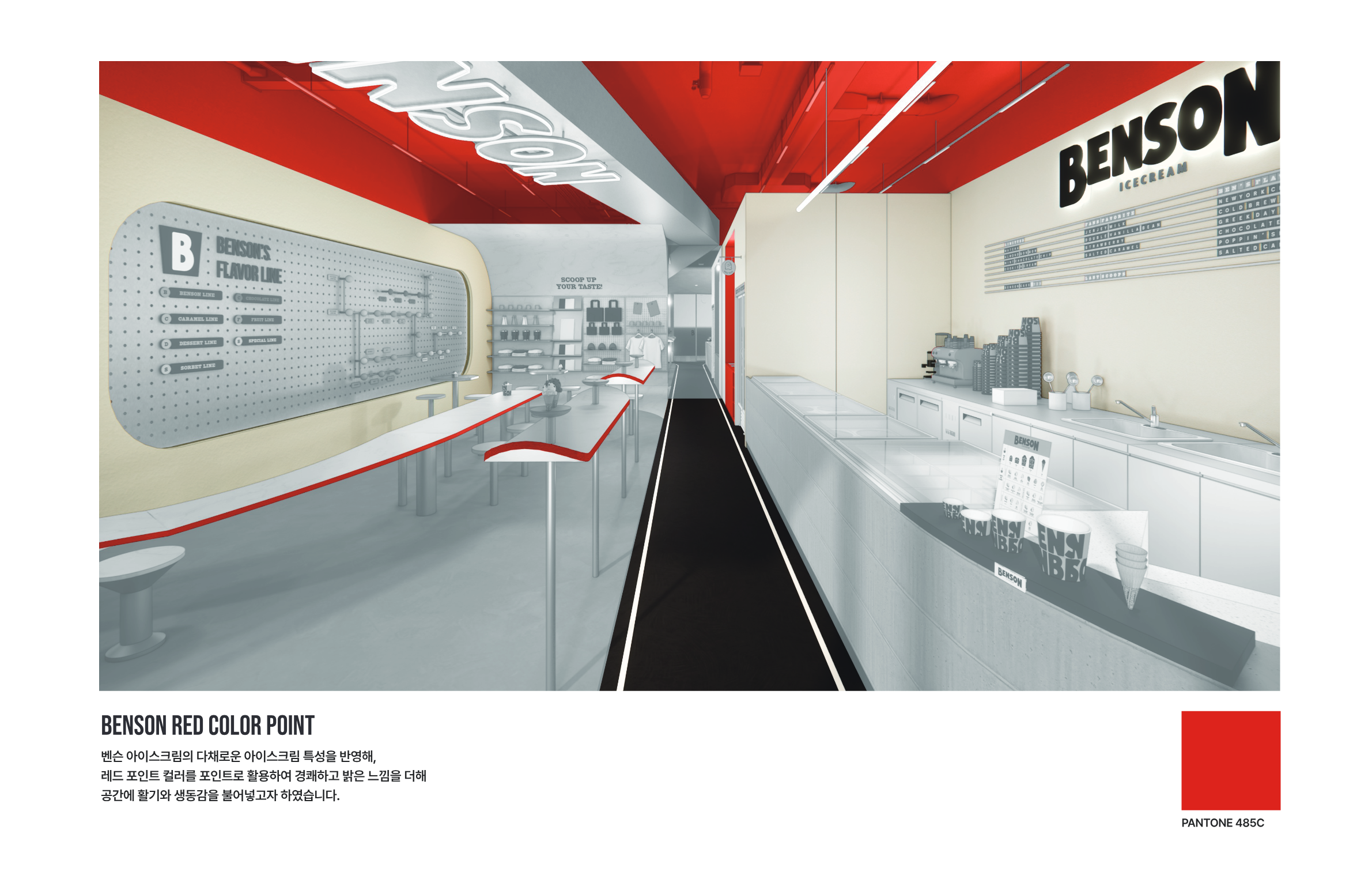
벤슨 아이스크림의 다채로운 아이스크림 특성을 반영해, 레드 포인트 컬러를 활용하여 경쾌하고 밝은 느낌을 더해 공간에 활기와 생동감을 불어넣고자 하였습니다.
Reflecting the vibrant variety of Benson's ice cream lineup, a bold red accent color is used throughout the space to add a lively, upbeat energy and inject a sense of vitality into every corner.
PANTONE 485C08 — Layout
Space Planning
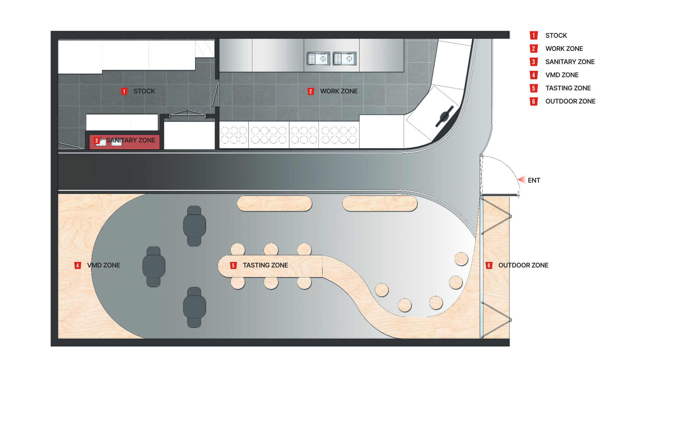
아이스크림 제조 동선과 고객 체험 공간을 효율적으로 분리하면서도 시각적 연결을 유지한 레이아웃
A layout that efficiently separates ice cream production flow from the customer experience zone while maintaining visual connectivity throughout.
09 — Technical
Detail & VMD